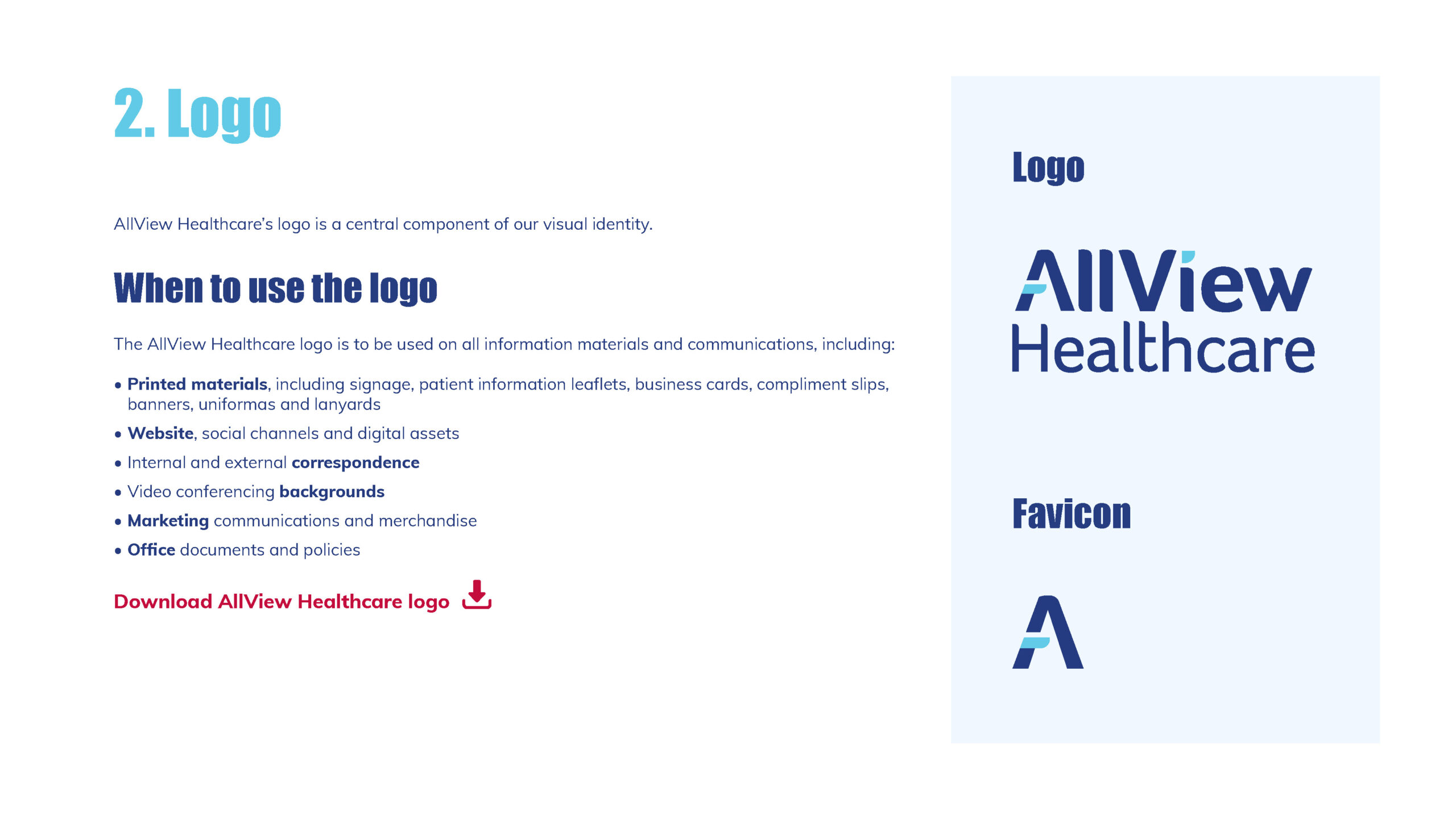
Digital assets: brand guidelines, PPT templates, HTML email signatures, icons, graphics, charts, and presentations.
Printed materials: patient information leaflets, brochures, medical forms, business cards, signage, car wraps, lanyards, water bottles, coffee cups, and conference banners.
Examples
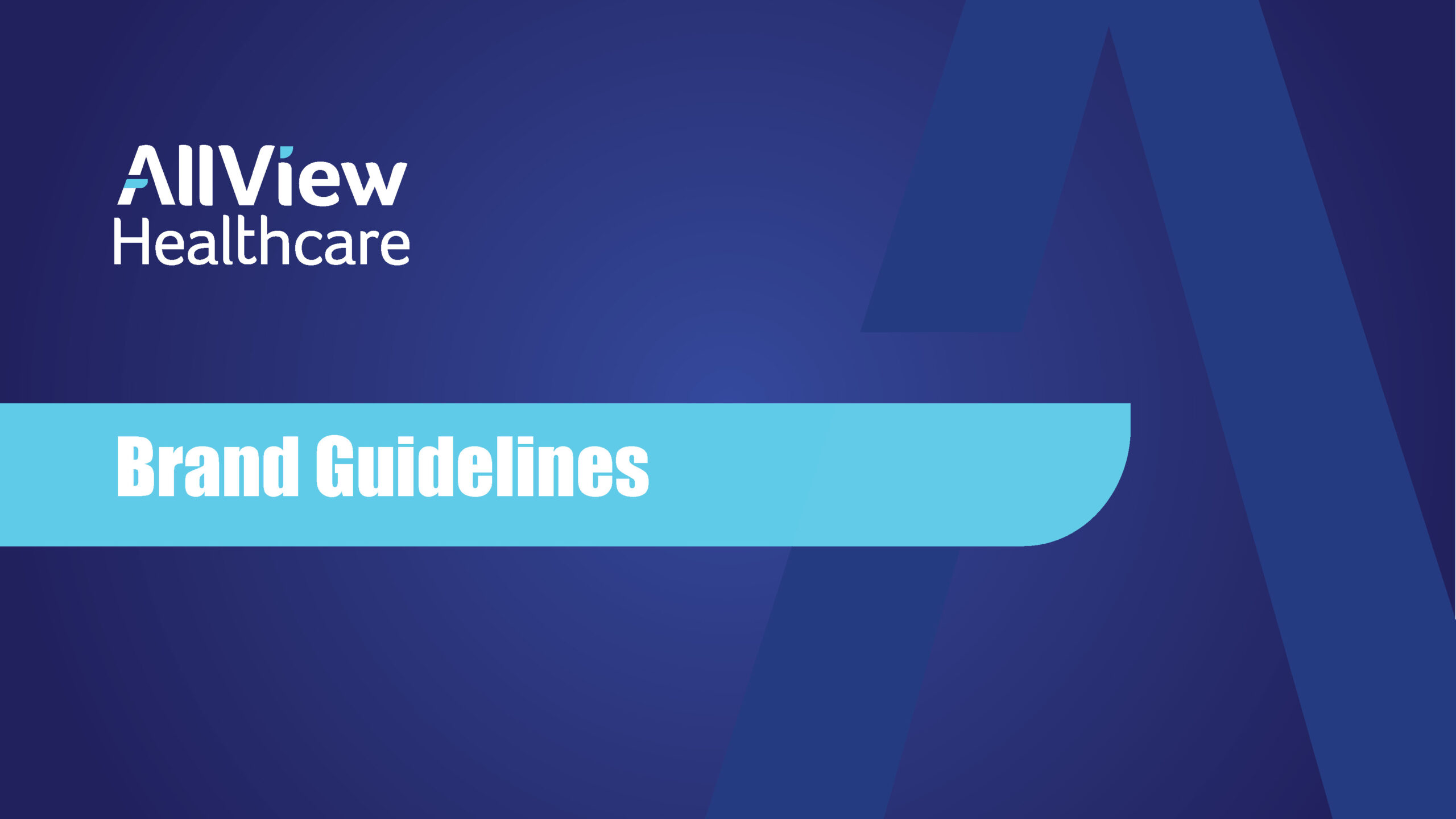
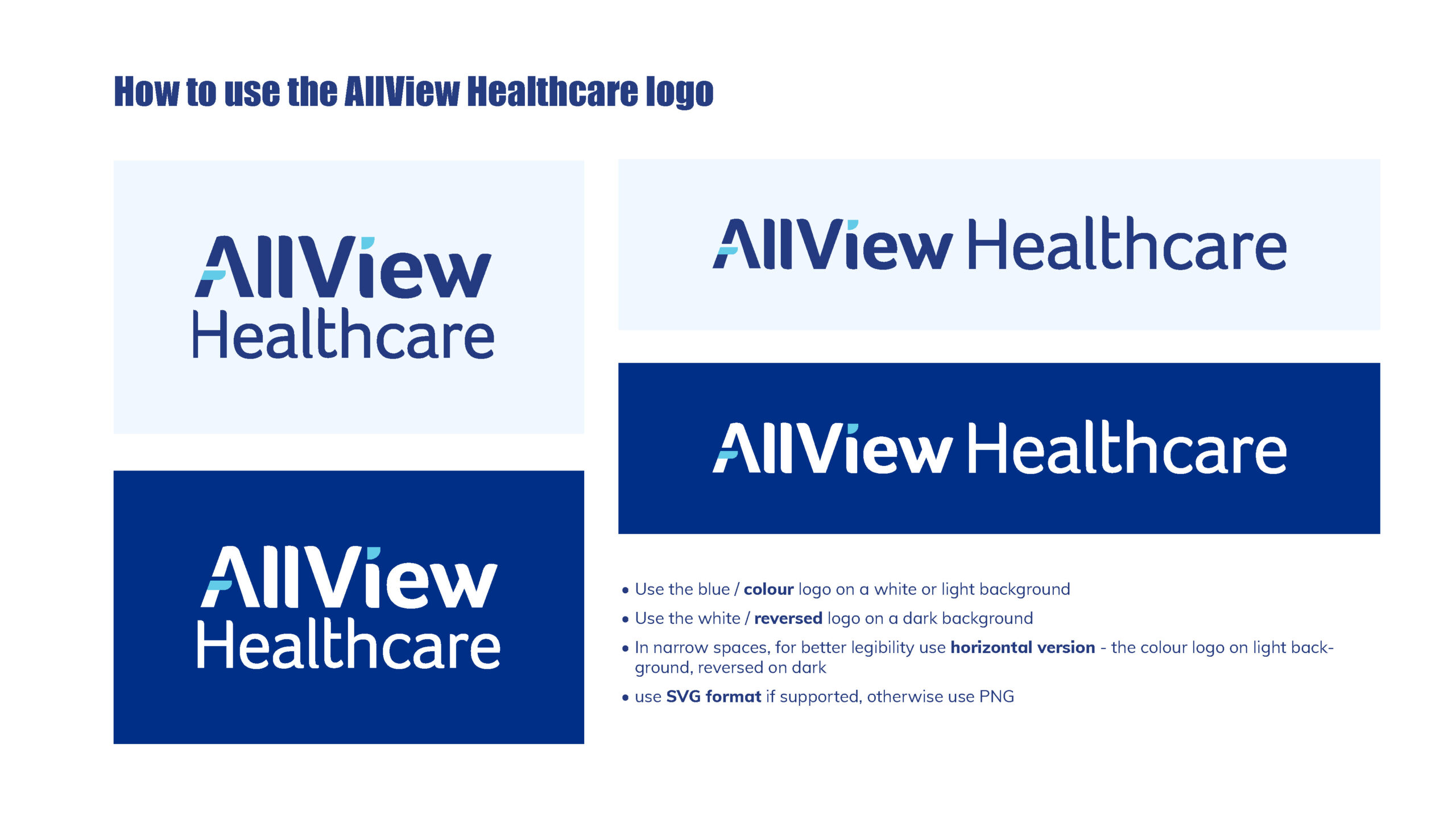
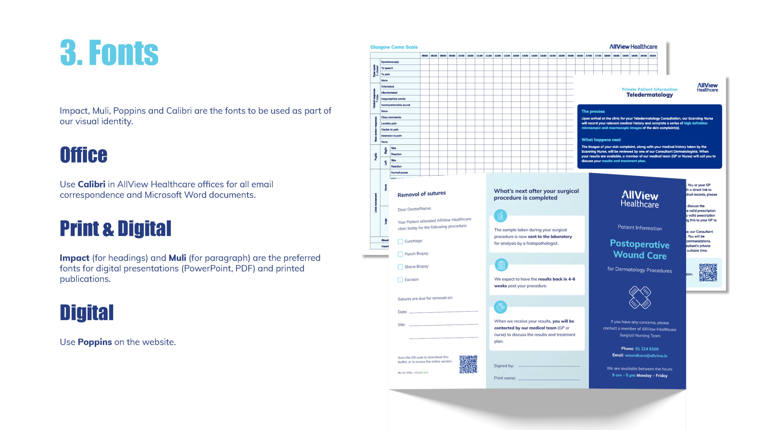
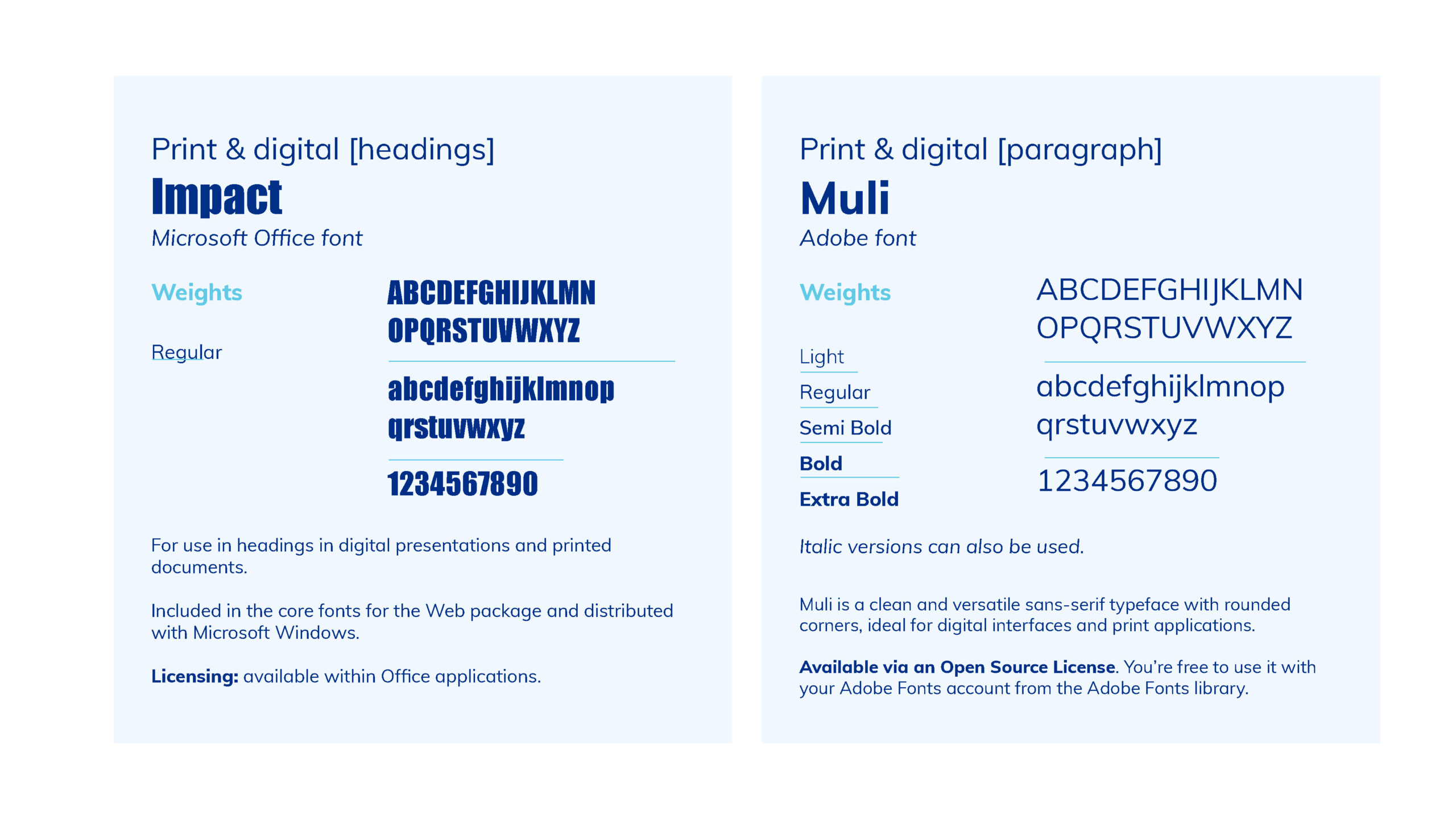
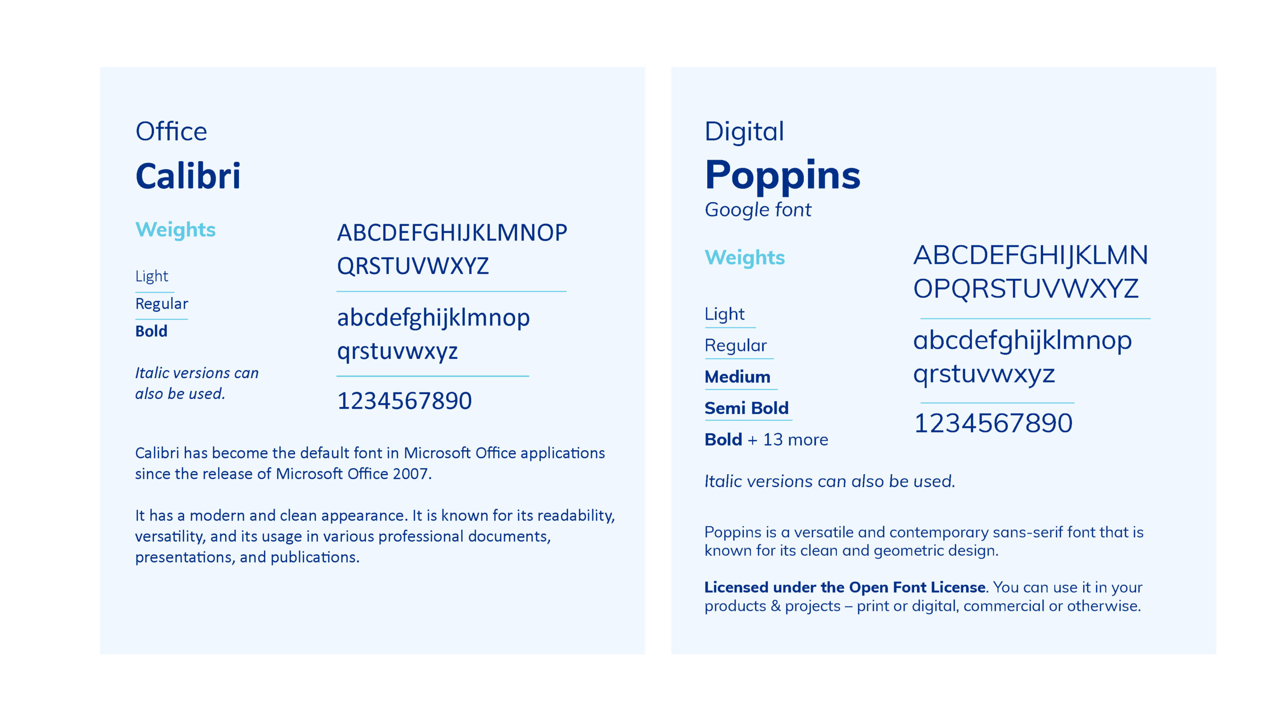
Brand Guidelines
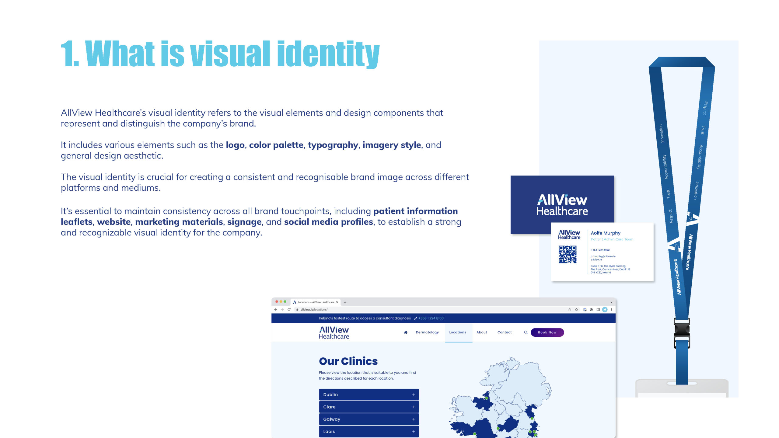
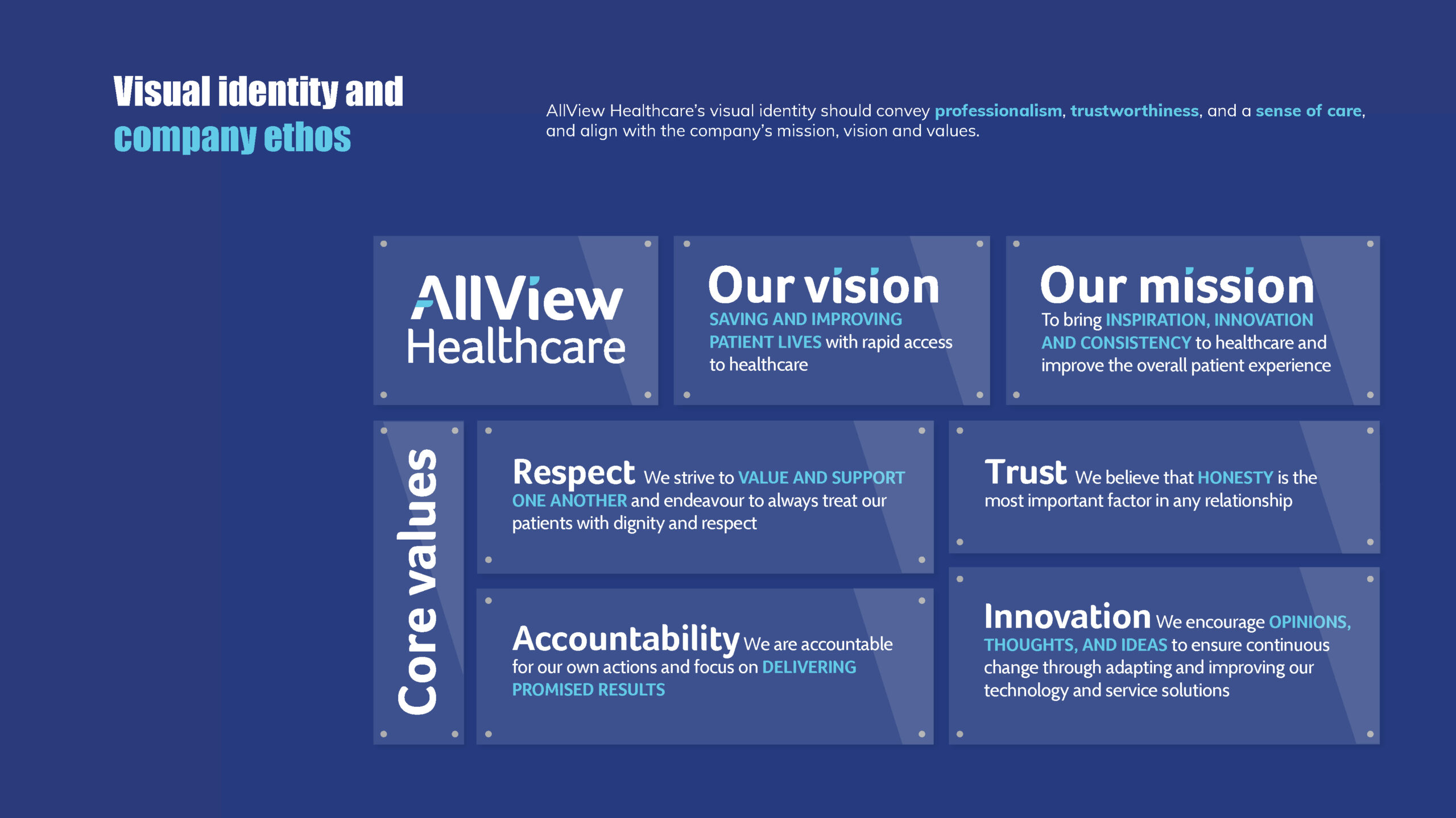
I developed comprehensive brand guidelines from scratch for a MedTech startup that previously lacked an established design vocabulary. These guidelines were essential in defining the company’s visual identity and ensuring consistency across all touchpoints. I curated a cohesive color palette, selected appropriate typography, and established imagery standards, with a focus on authentic visuals that would foster trust in a highly regulated healthcare environment.
The result was a professional and modern brand presence that aligned with the company’s mission and values, giving them a clear and recognizable identity.
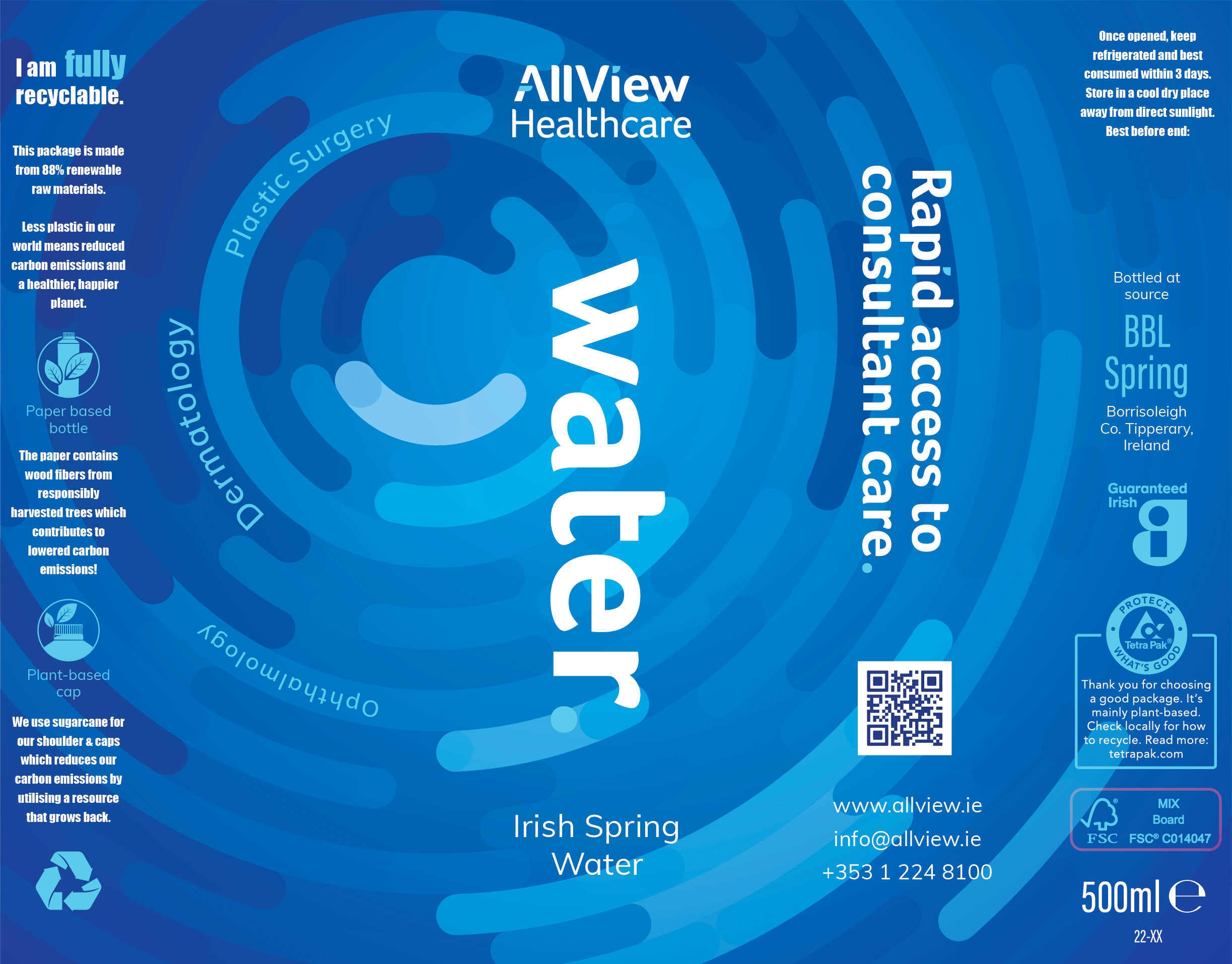
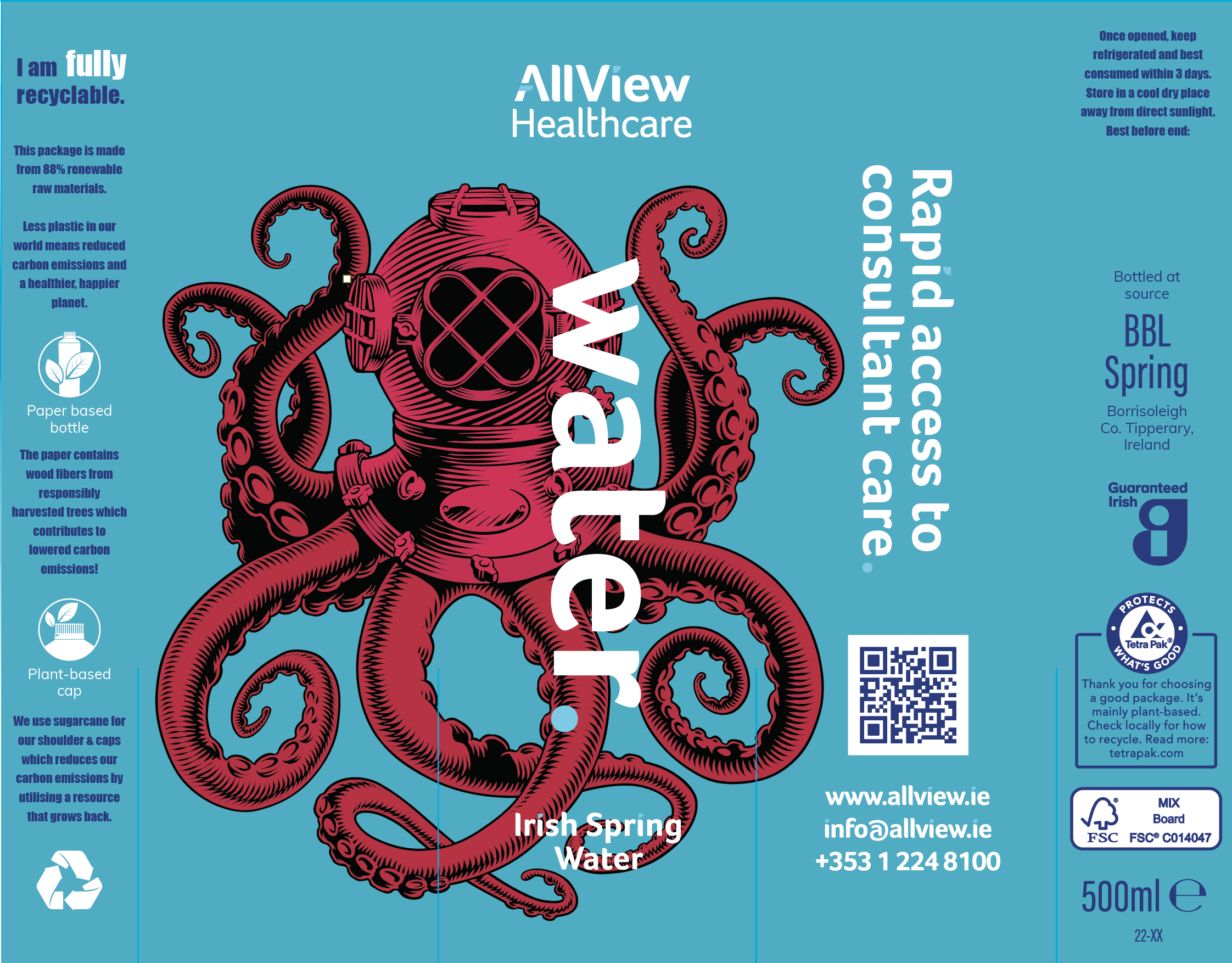
Water Bottle
When designing a water bottle, I presented two distinct concepts. One featured ‘Ali, the Octopus,’ a mascot designed as part of a broader strategy for pediatric services. Ali was intended to be more than just a design element; it would be integrated into the clinic environment as an engaging character for children.
The concept included a large octopus-shaped bin in the waiting room, where children could play an educational game about fascinating octopus skin facts while waiting for their dermatology appointments. This playful approach aimed to create a more positive and engaging experience for young patients.
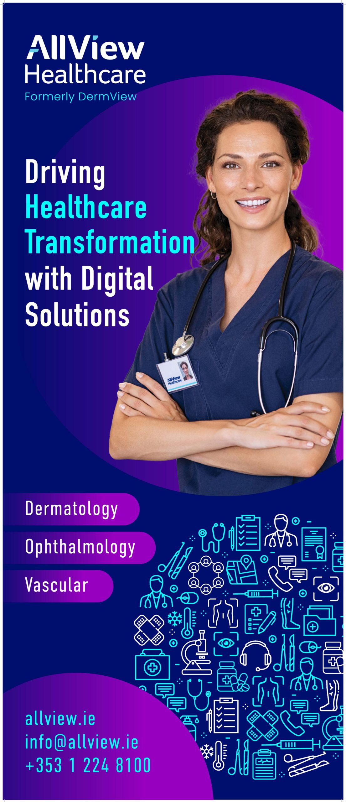
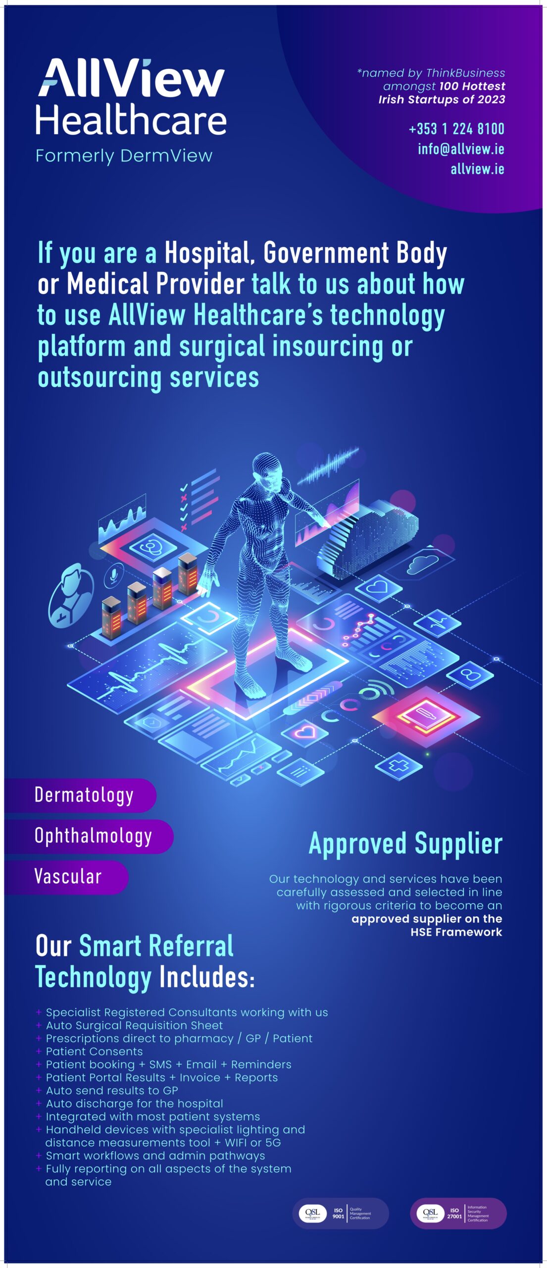
Conference Banners
I designed those two banners for a healthcare conference as a visual tool to convey the company’s modern, technology-driven approach.
The design focused on showcasing the company’s cutting-edge medical services, helping to position the company as a forward-thinking and award-winning leader in the healthcare technology space.
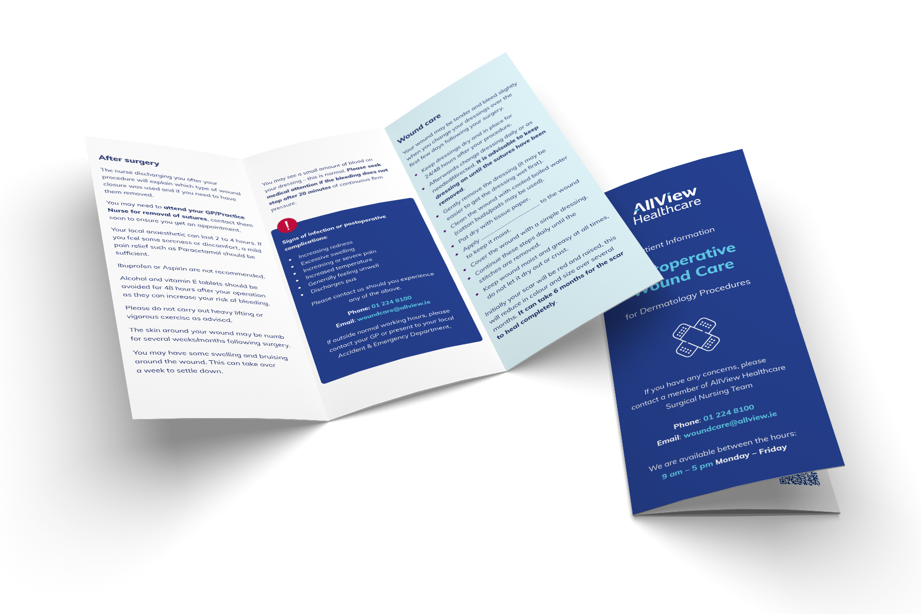
Patient Information Leaflets
I designed Patient Information Leaflets with a strong focus on accessibility, ensuring that all patients could easily access the information they needed. Each leaflet included a QR code, directing users to a digital version of the content available on the company’s website.
This digital format allowed users to translate the text, enlarge it for better readability, or even print additional copies if needed. The goal was to provide a more inclusive and user-friendly experience, giving patients multiple ways to engage with the important medical information provided.