A Case Study in Intuitive UX
Redesigning Booking Experience
UX Design is a process, and here, you’ll see how I approach it step by step.
It’s a problem-solving discipline at its core. In the study below, you’ll discover how I conduct research to define the problem and the methods I use to find solutions.
The journey culminates in a prototype, which you can explore and test yourself on Figma.
01. Research
Usability Testing
I find Usability Testing to be one of the main tools in UX Design. What it is and why it’s essential?
It is a method used to evaluate a product by testing it with users to identify usability problems. The primary aim is to ensure that the product is easy to use, efficient, and meets the needs of its intended audience.
Usability testing is performed at various stages of the UX process. In the early stages, during research and discovery, it helps understand user needs and establish baseline metrics. During the design phase, wireframe and prototype testing refine design and functionality based on user feedback.
As development progresses, iterative testing ensures ongoing alignment with user expectations. Pre-launch beta testing uncovers any remaining issues before the product goes live. Finally, post-launch usability testing continues to identify new issues and gather feedback on updates, ensuring the product remains user-friendly and effective.
Before Usability Testing
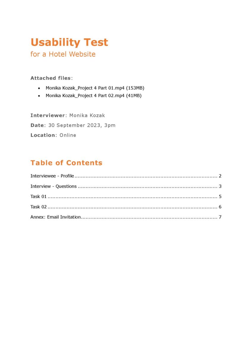
Before conducting a usability test, several preparatory steps are essential to ensure the test is effective and provides valuable insights. These steps include:
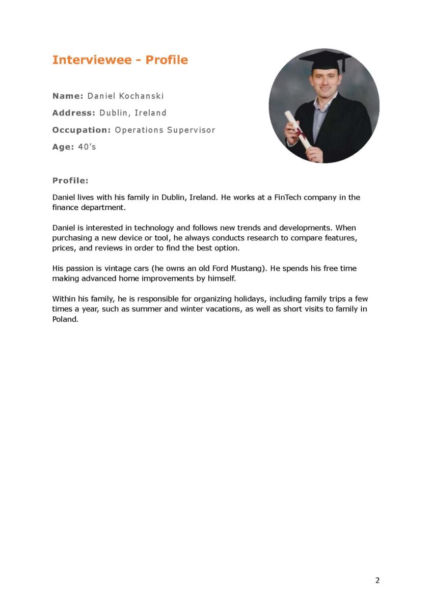
- defining the user profile,
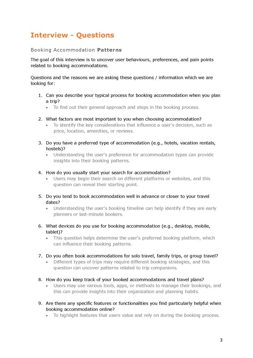
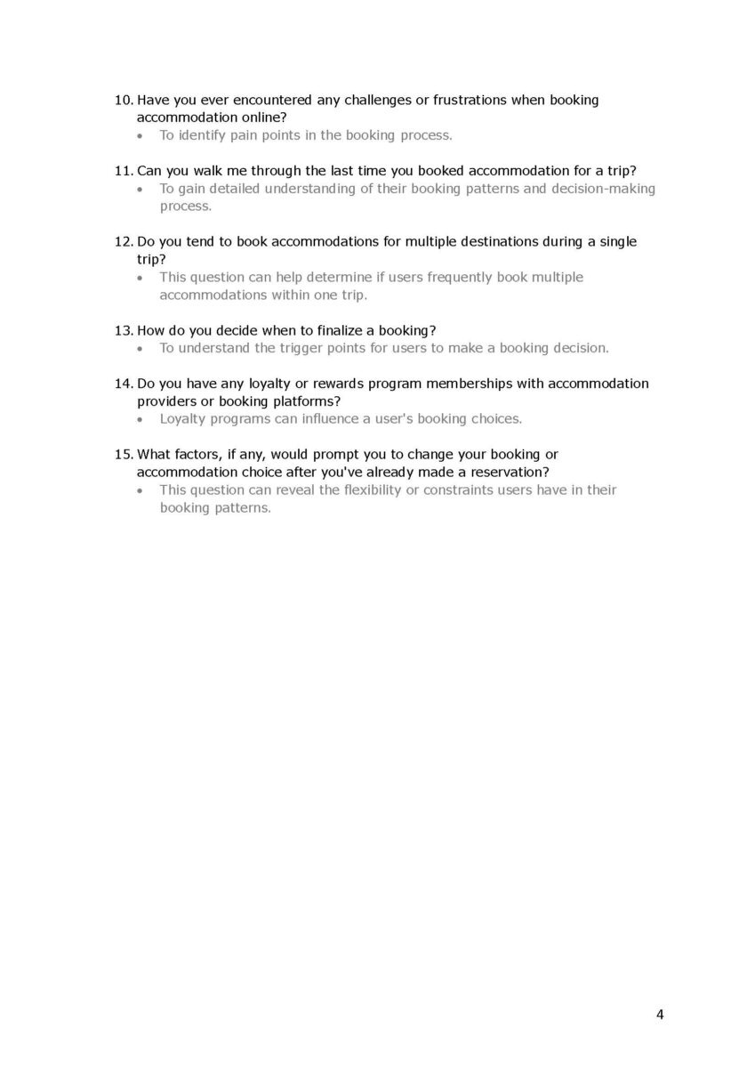
- preparing interview questions,
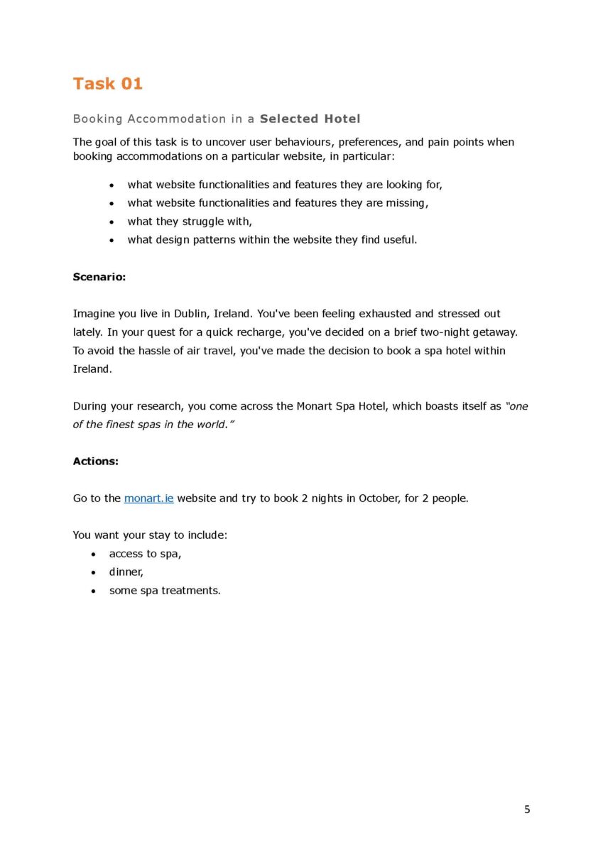
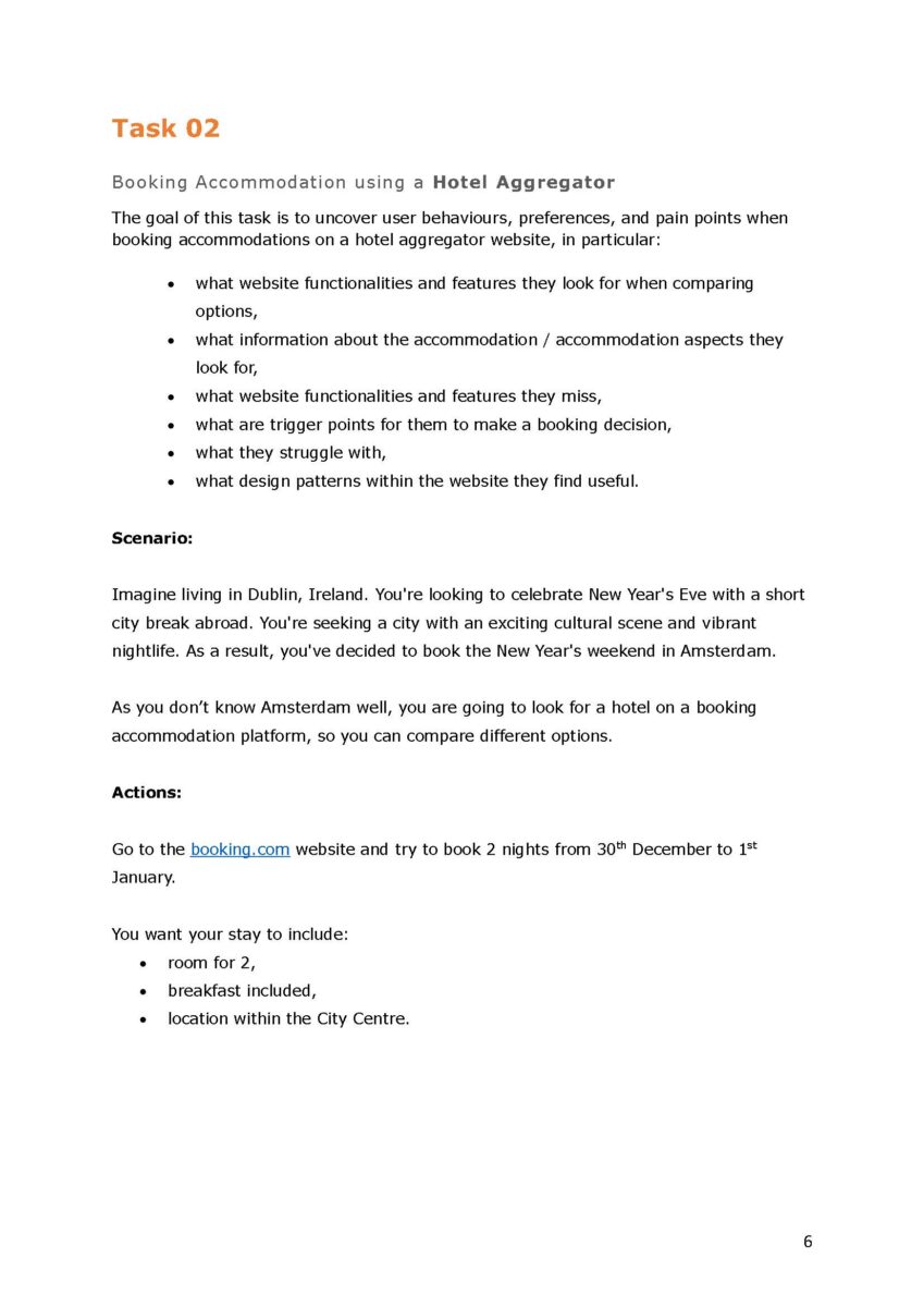
- creating task scripts, and
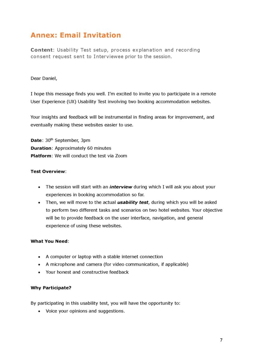
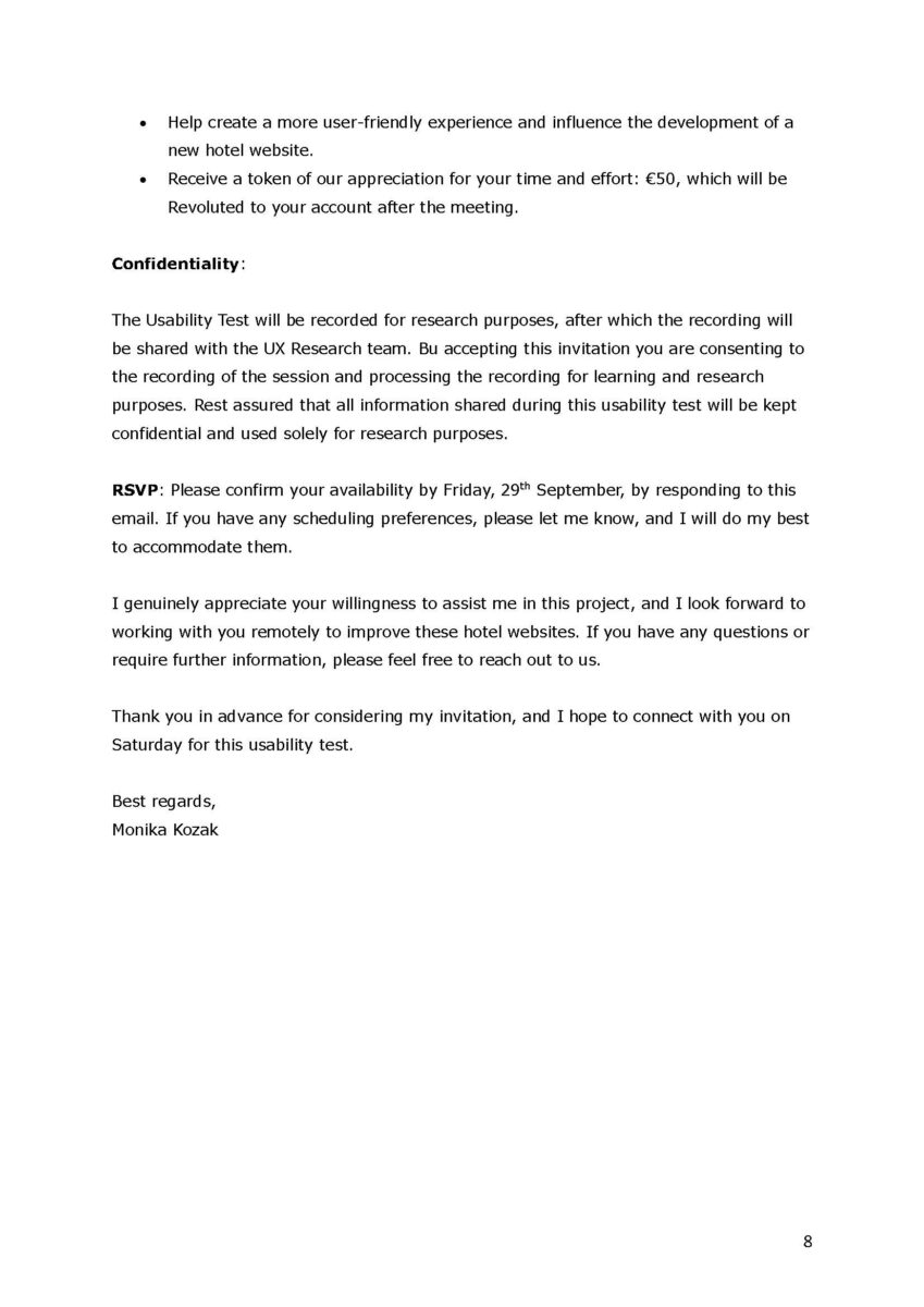
- sending email invitations to participants.
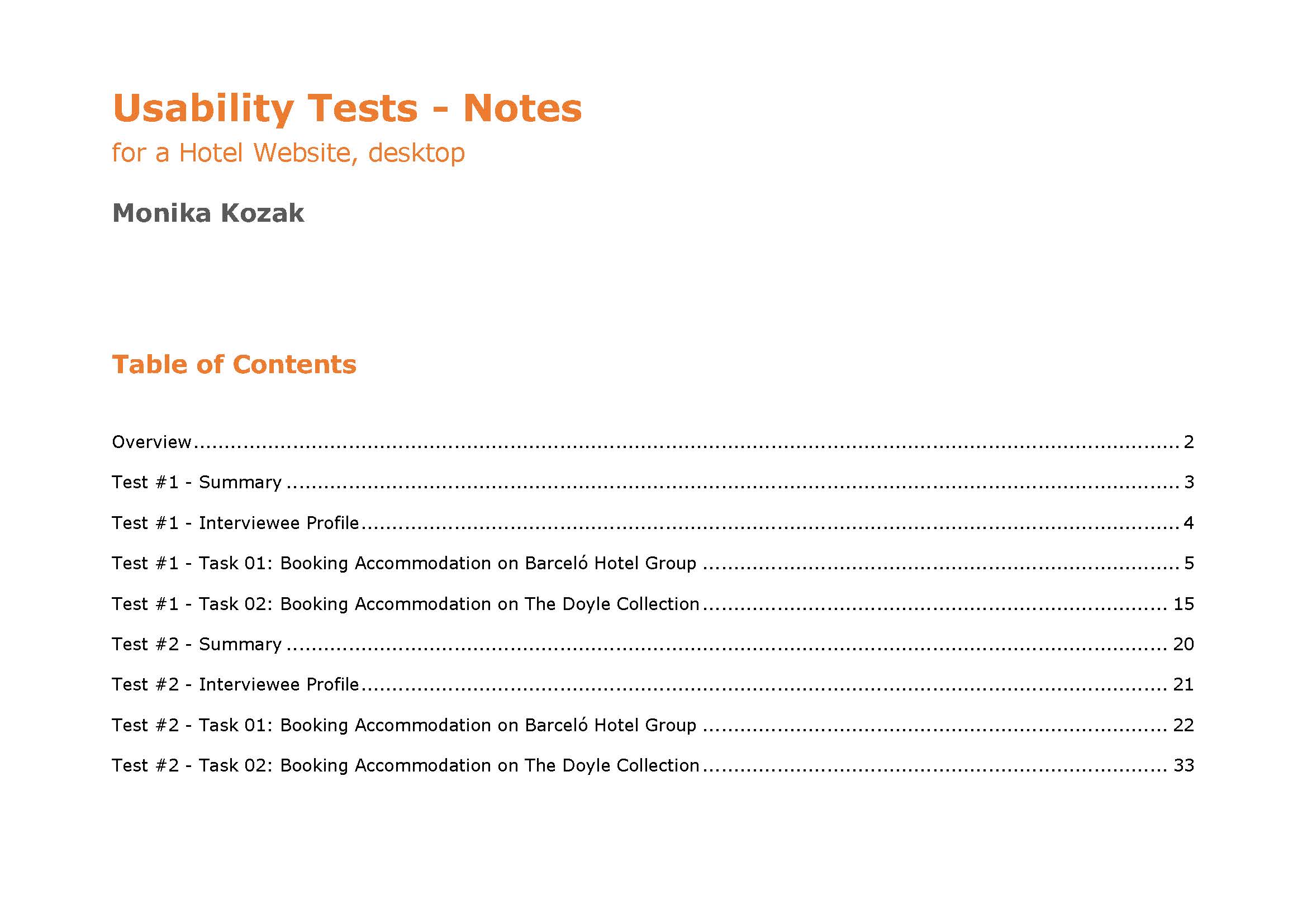
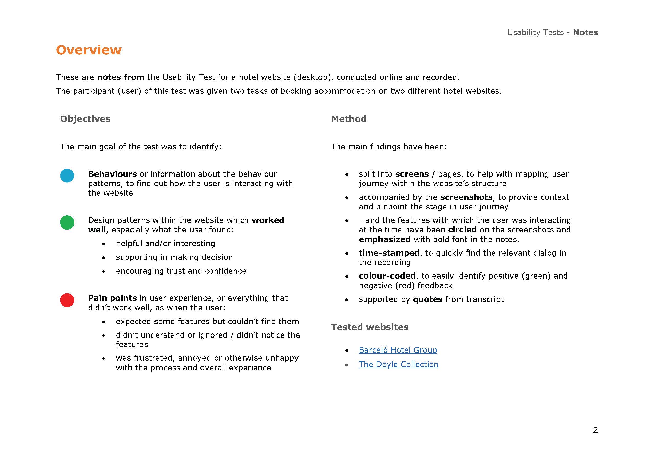
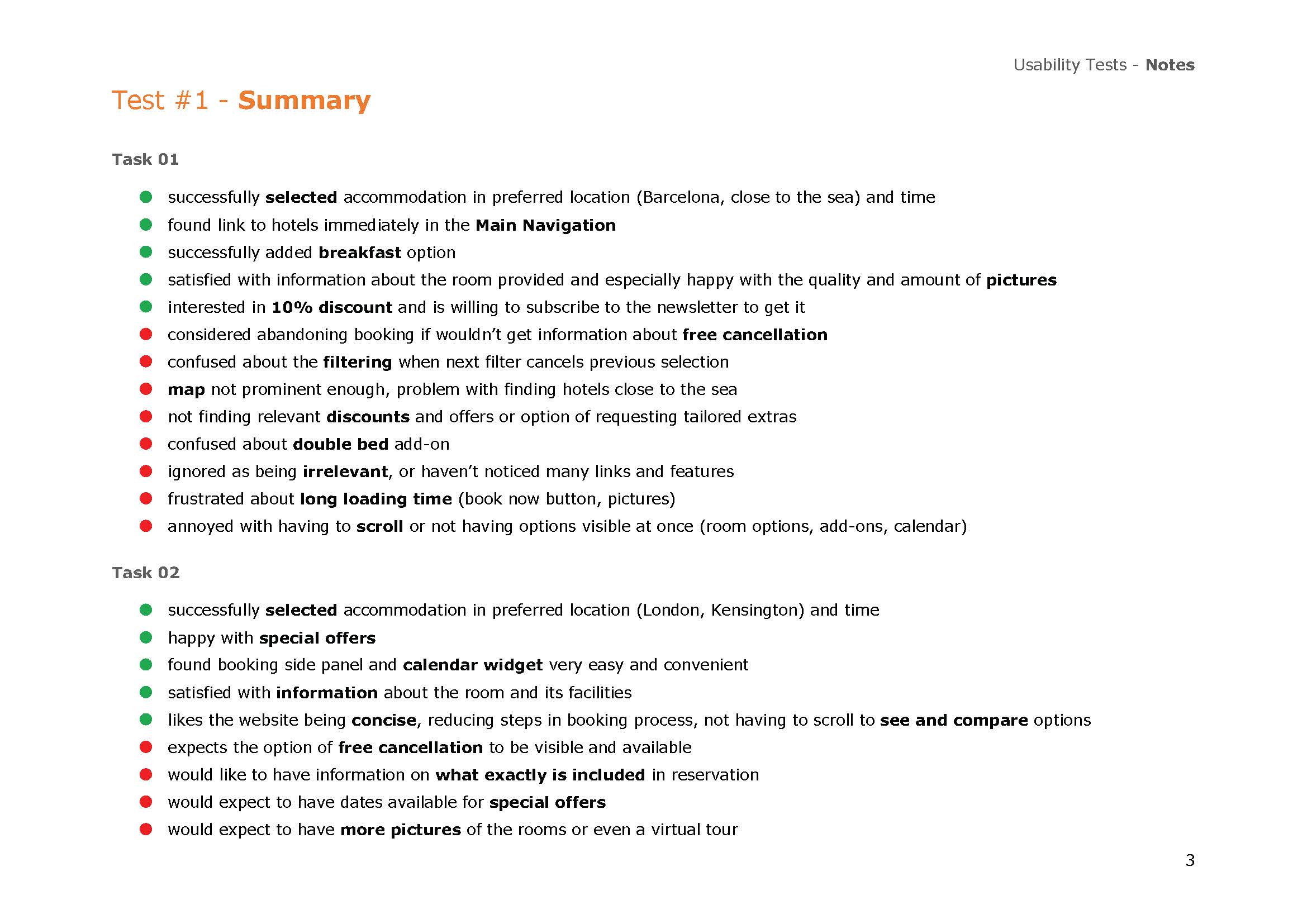
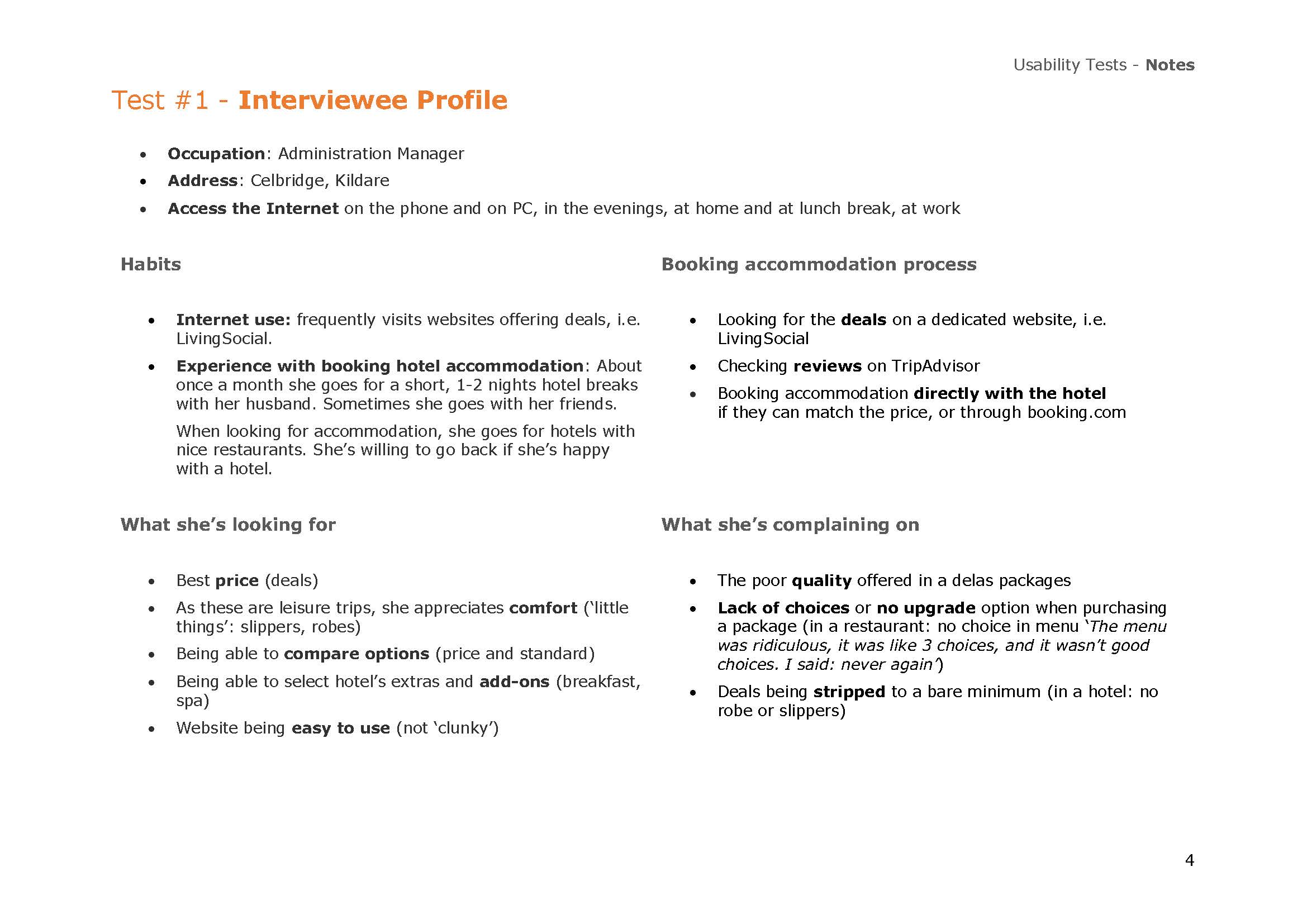
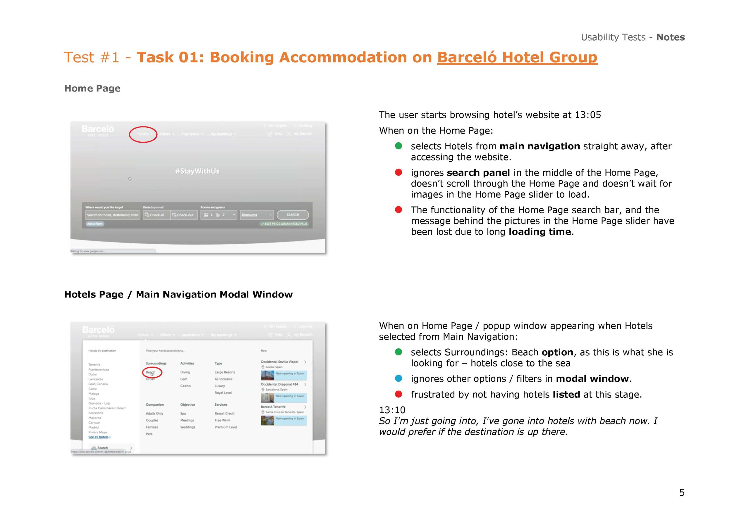
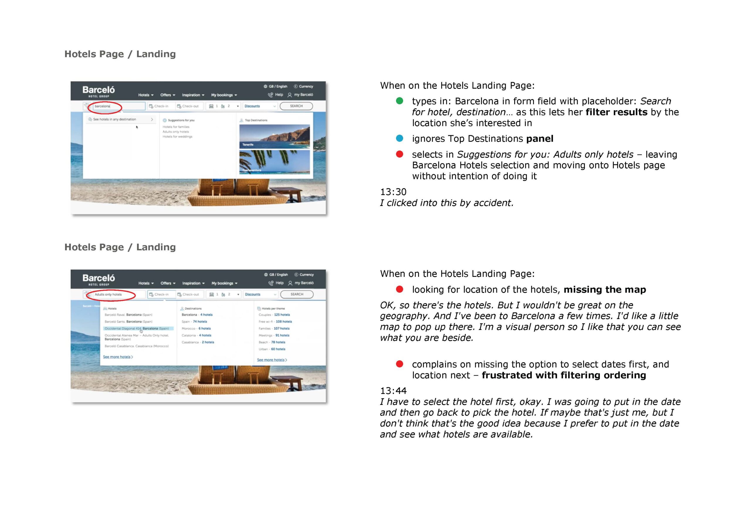
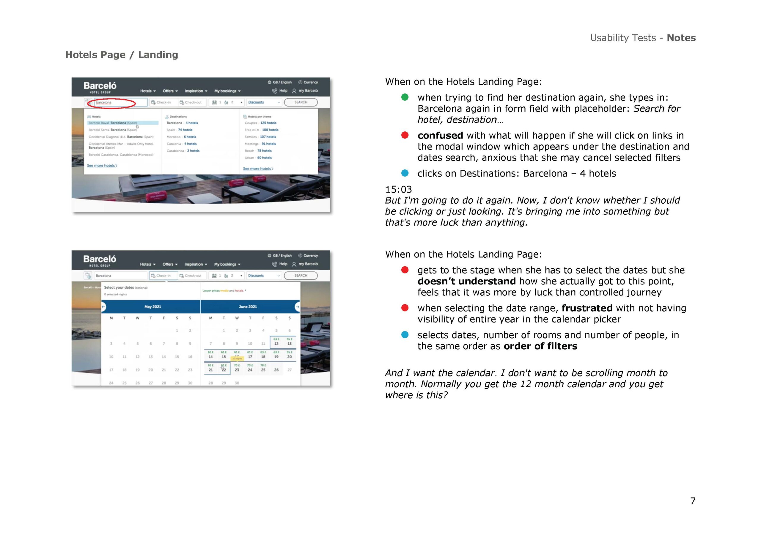
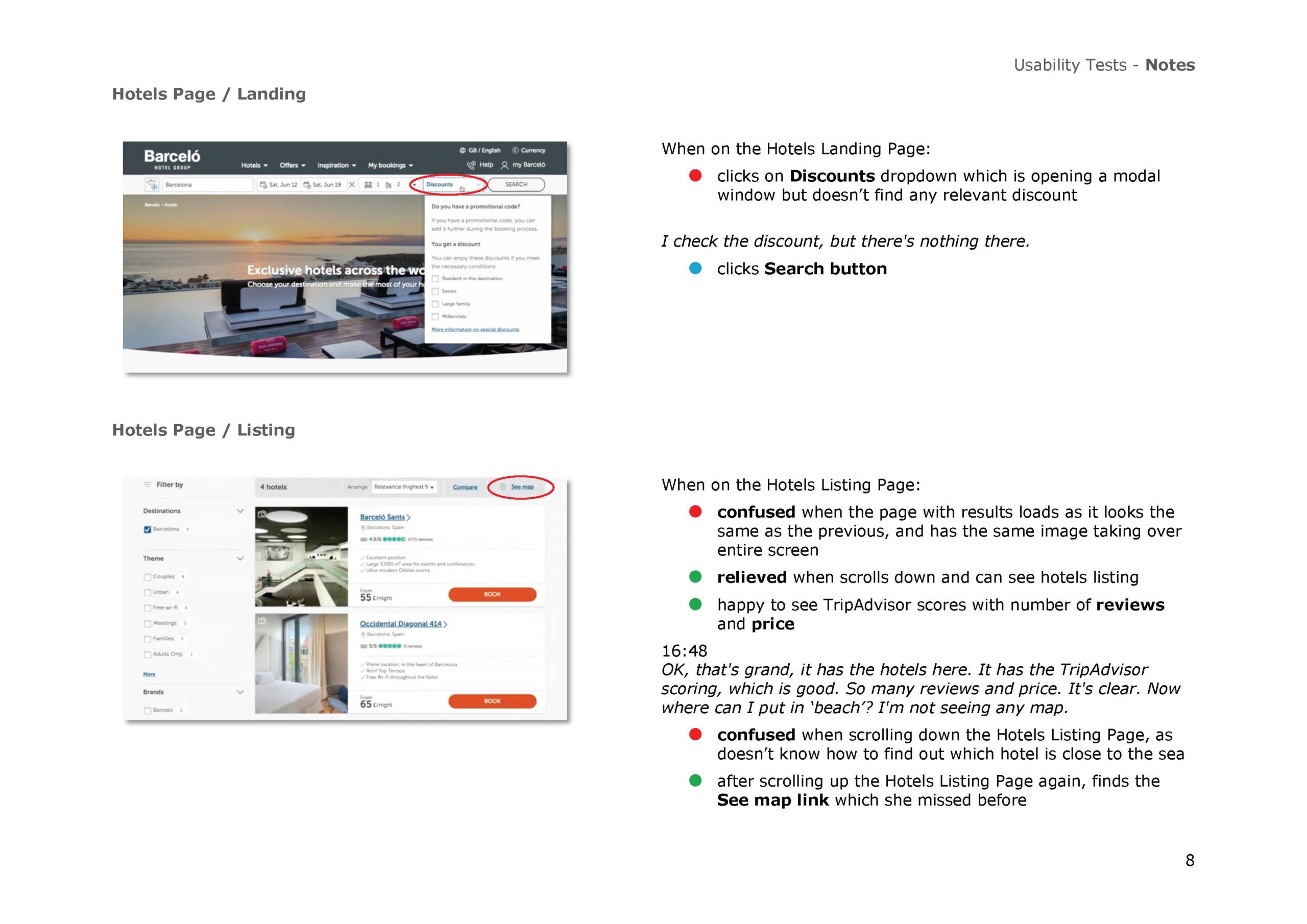
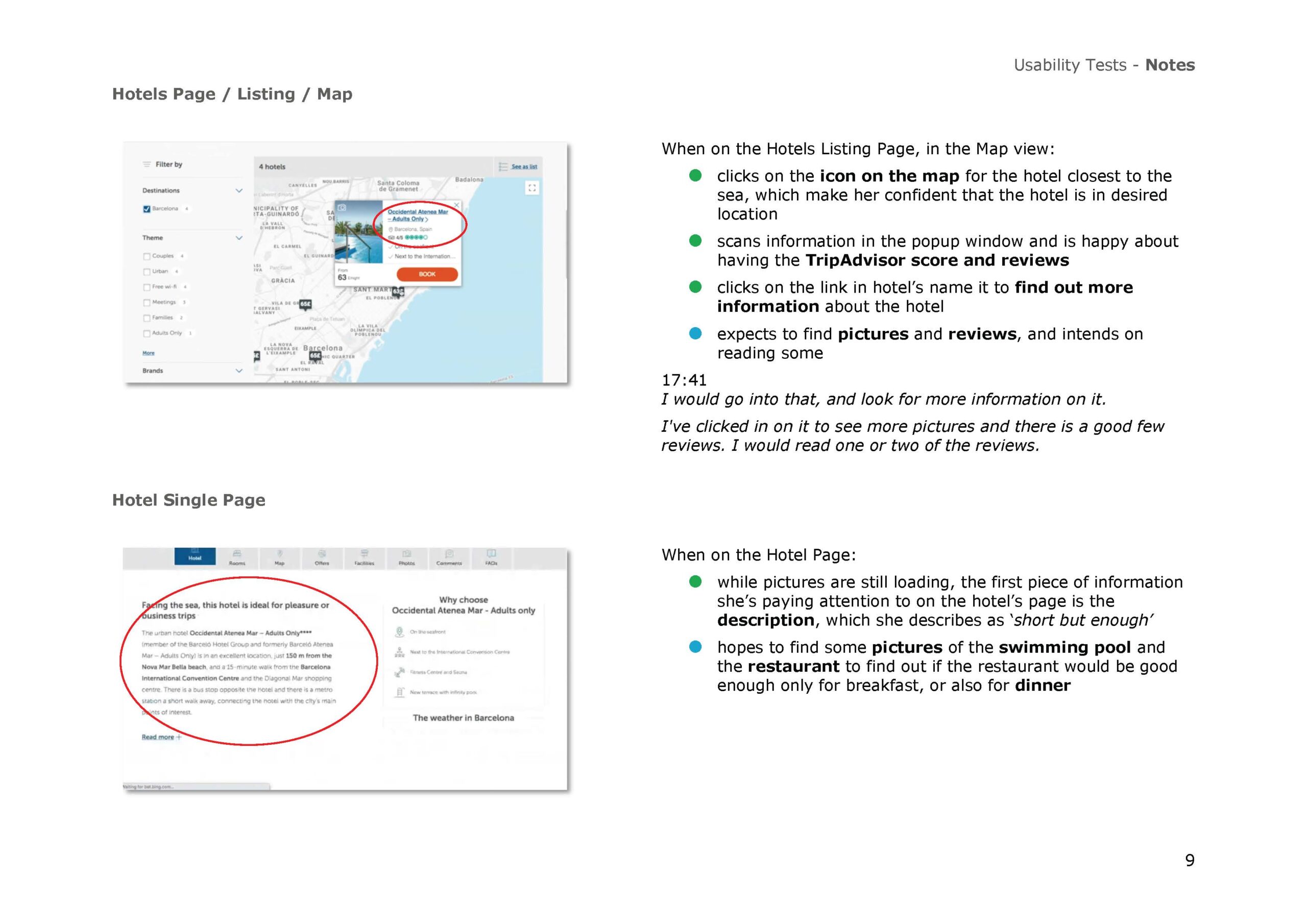
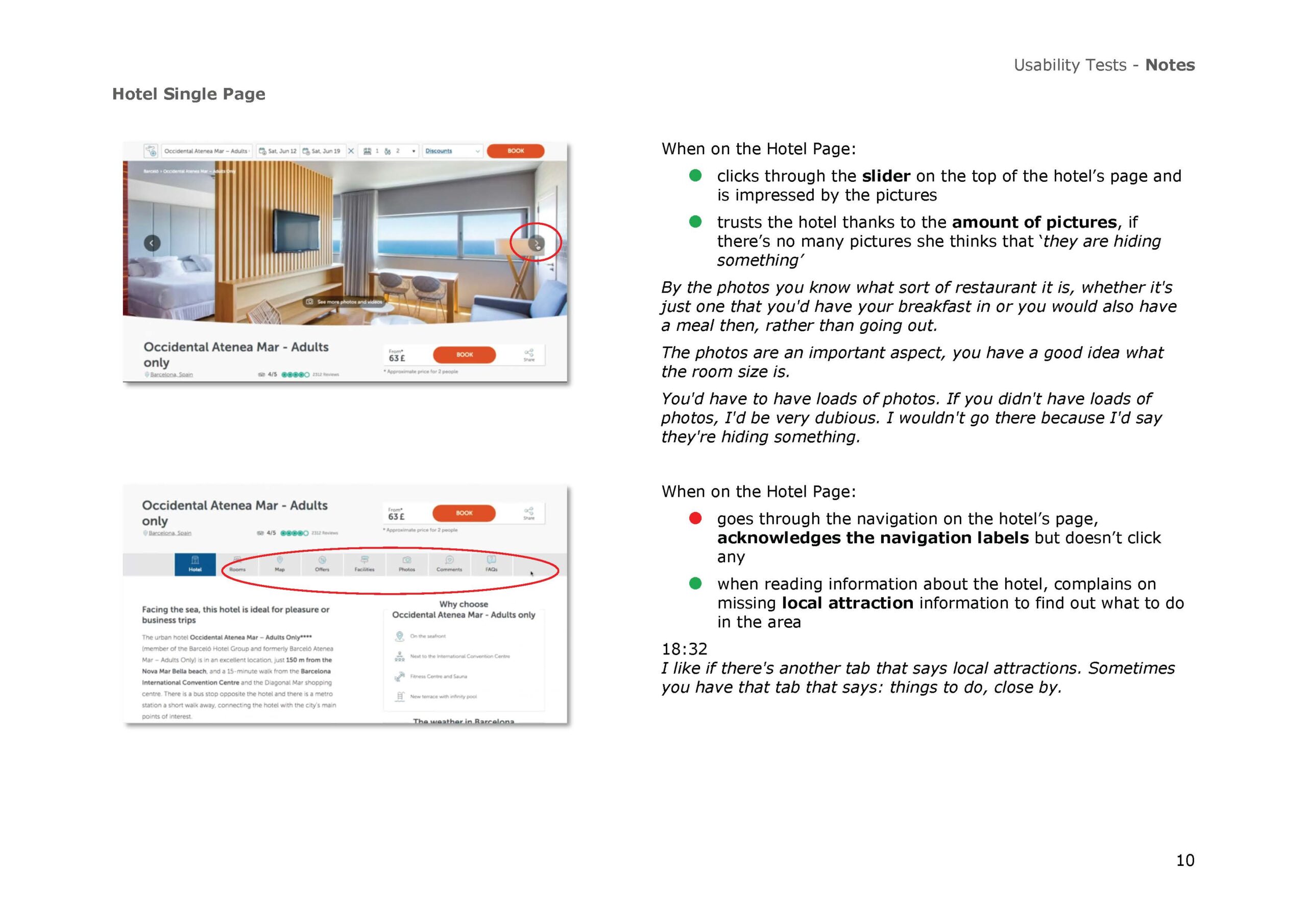
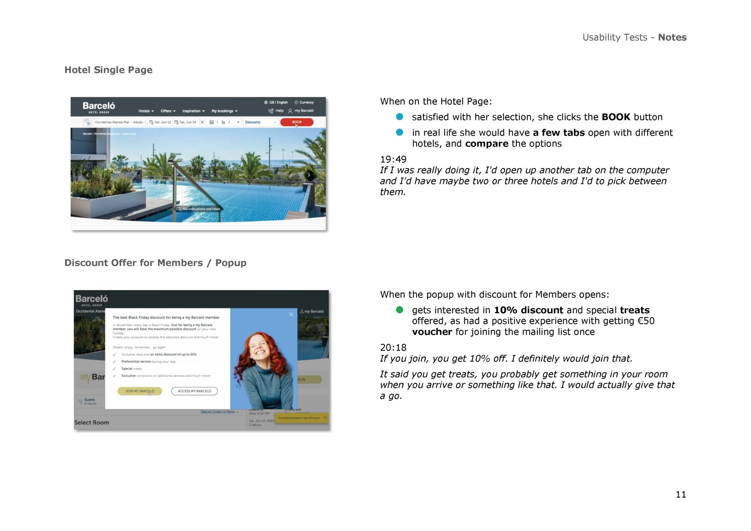
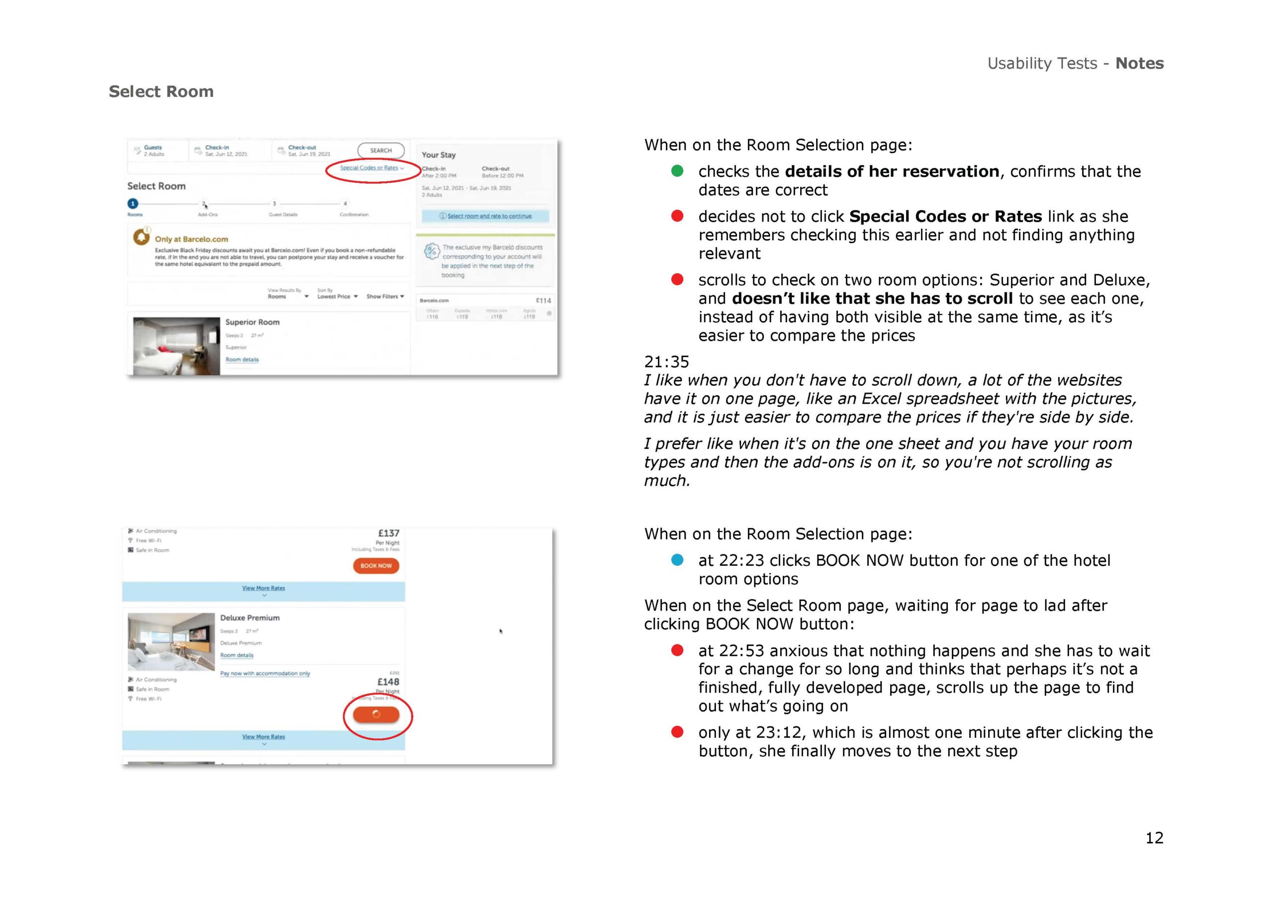
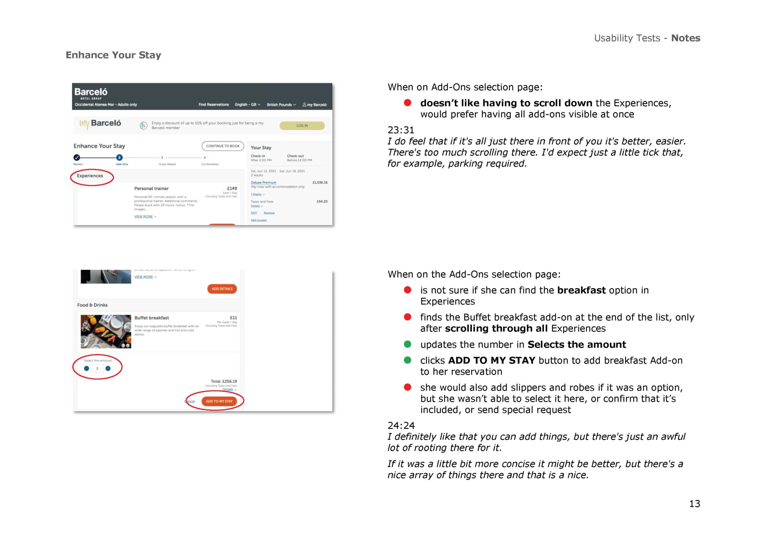
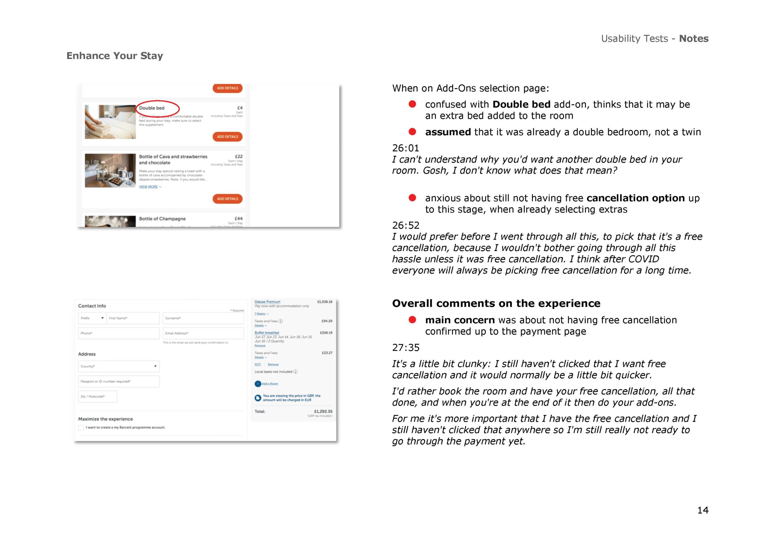
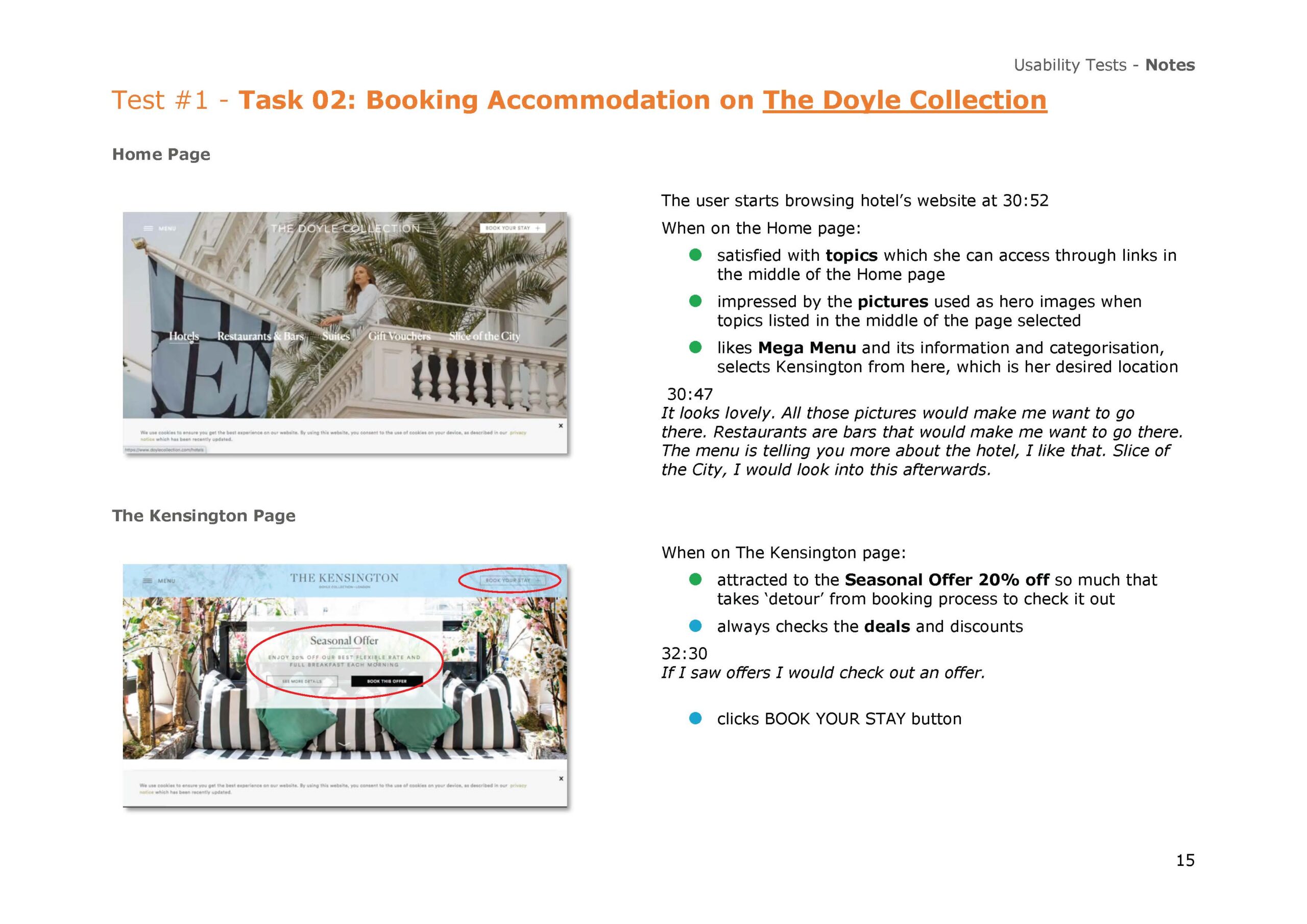
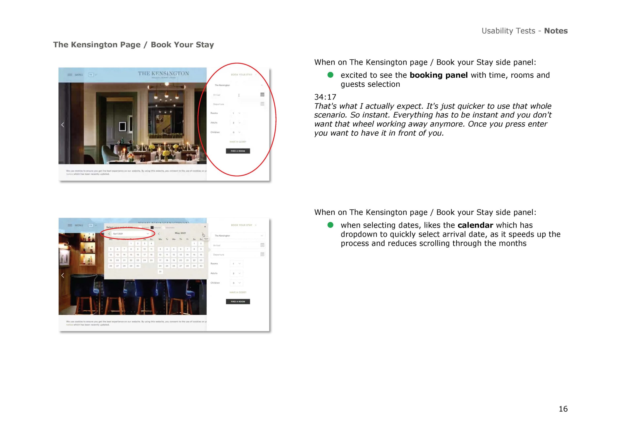
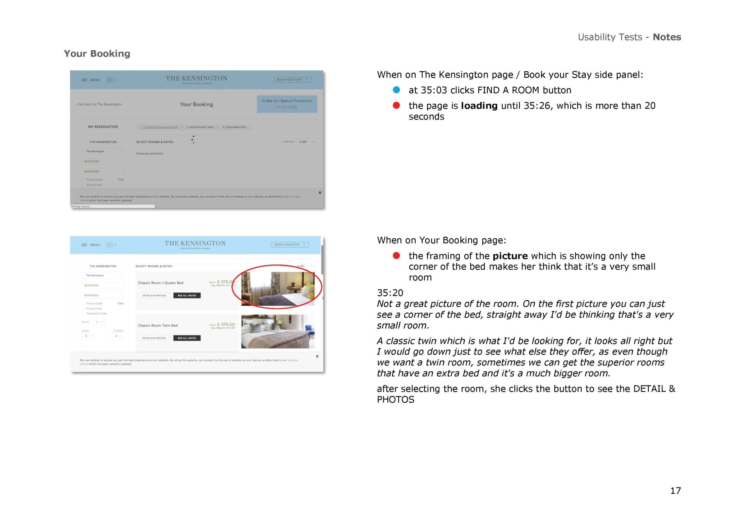
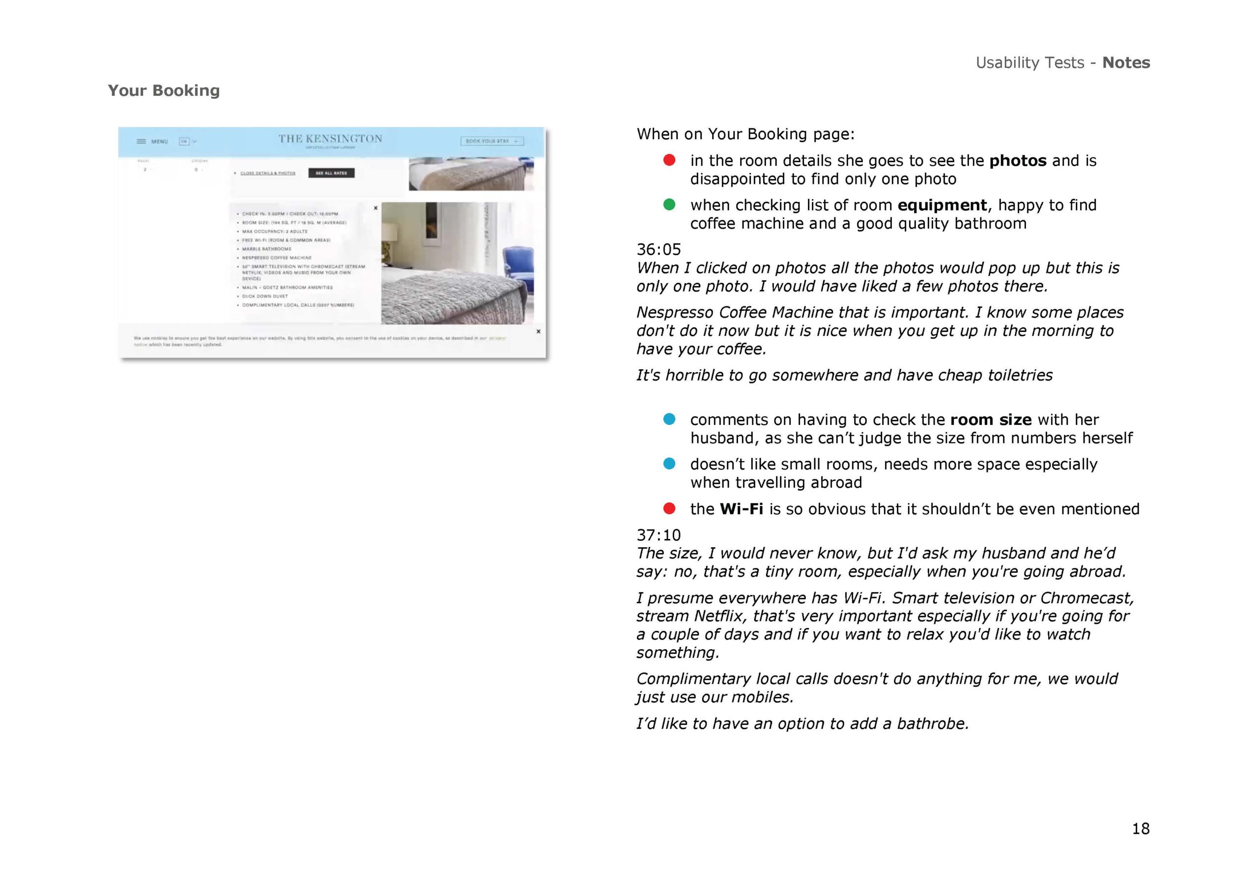
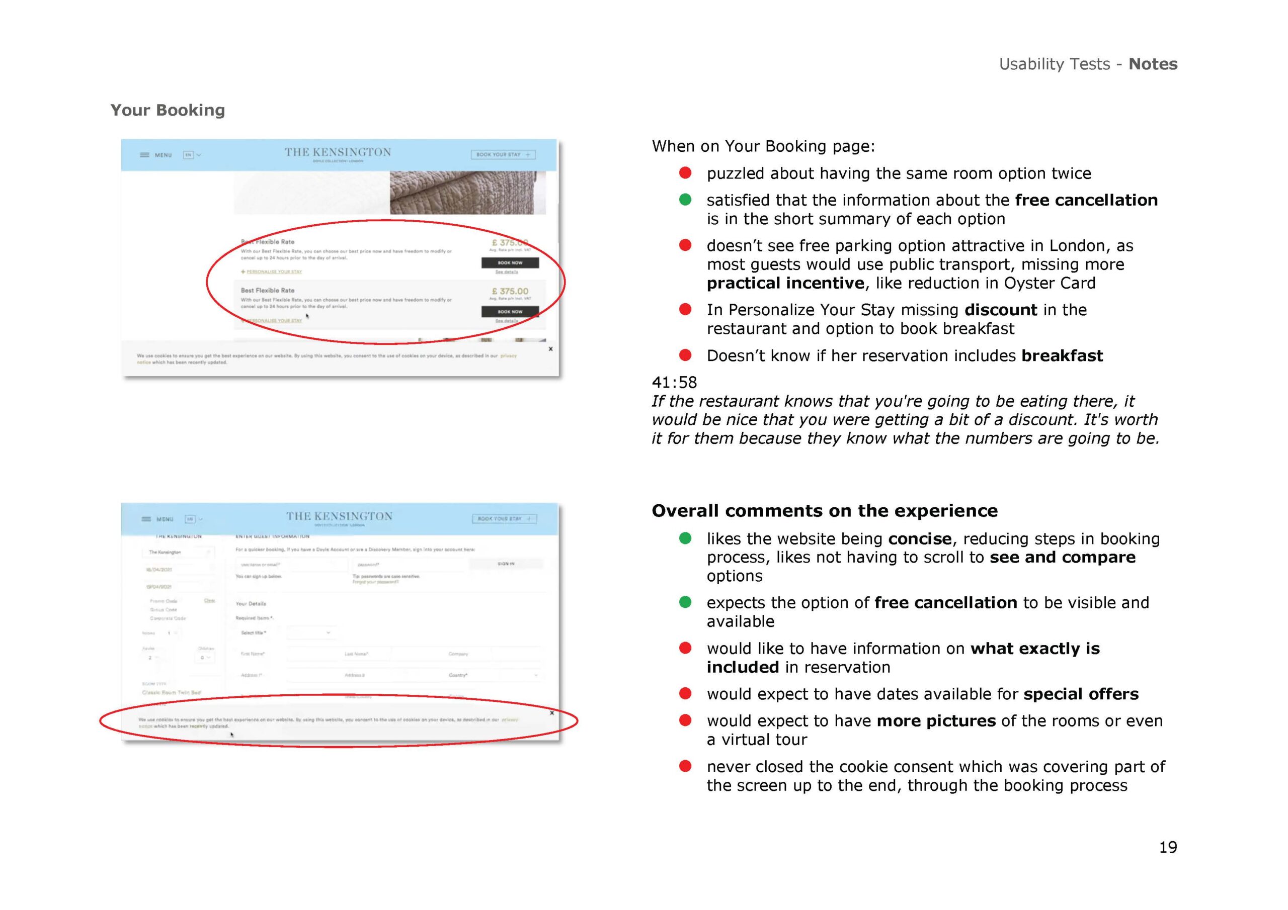
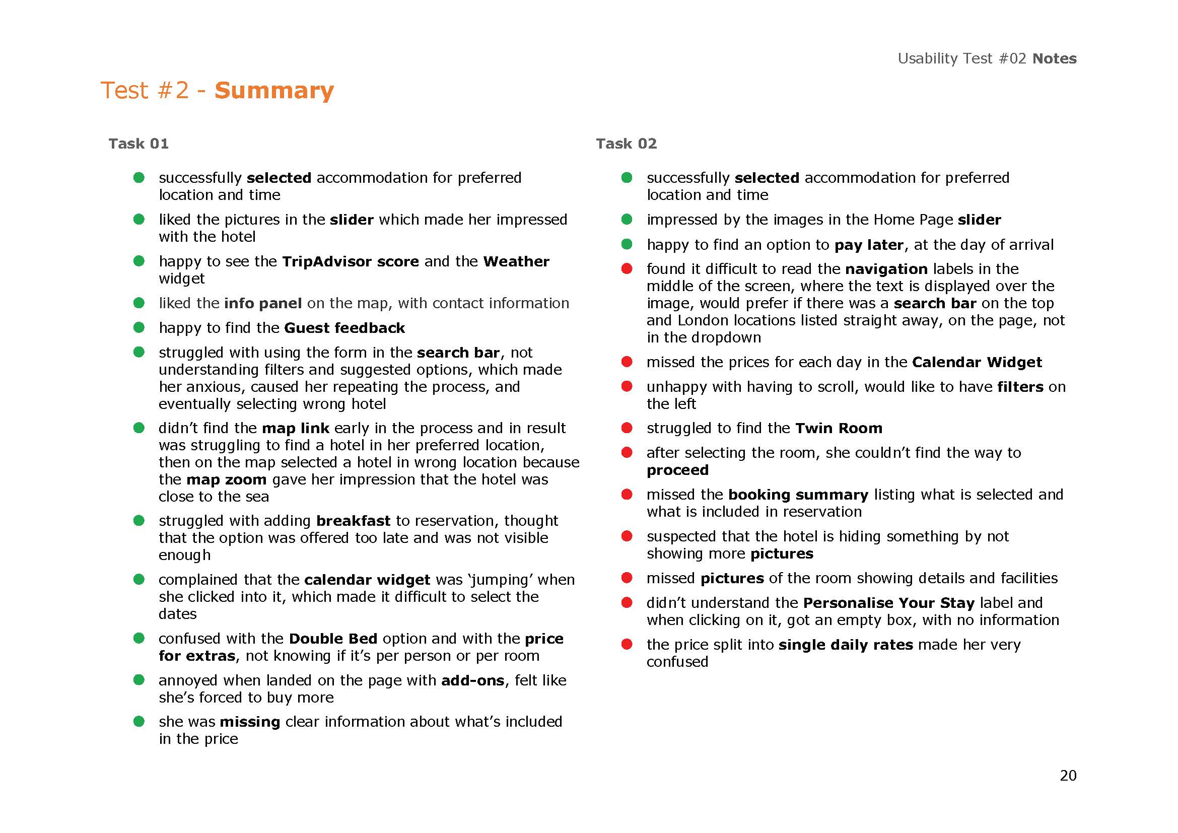
Notes from Usability Testing
Note-taking in the UX process, particularly during usability testing, is a critical practice for capturing detailed observations and insights about user interactions with a product. Effective note-taking involves documenting users’ actions, comments, non-verbal cues, and any difficulties they encounter while performing tasks.
This documentation helps to identify patterns, common issues, and user pain points.
Affinity Diagram
There comes a point in my UX Design process when I’m surrounded by yellow sticky notes, fluttering around me like butterflies in Macondo. I use them to organise and synthesise the data gathered from user research and usability testing. This method is called the Affinity Diagram. What it is and why it’s done?
The Affinity Diagram involves grouping related ideas, insights, and observations into clusters based on their natural relationships. By categorising data into themes, I can identify patterns, uncover hidden connections, and prioritise key issues and opportunities. It is instrumental in transforming raw data into actionable insights that drive user-centered design solutions.
Raw Research Data
The data used to create an affinity diagram comes from various sources of user research and usability testing. This includes qualitative data such as user interviews, surveys, observations, and feedback gathered during usability tests.
The process begins by collecting detailed notes of user interactions, behaviours, and comments.
This rich, qualitative data is then systematically sorted and grouped into clusters based on natural relationships and common themes during an affinity diagram session.
Sorting Data into Clusters of Issues
The research data was sorted into information clusters, which led to identifying 13 categories of issues.
By categorising the data into meaningful groups, we can identify patterns and insights that inform design decisions. This method helps in organising complex information, making it easier to uncover hidden connections and prioritise user needs, ultimately leading to more user-centered design solutions.
Navigation Issues and Confusion
Visual Appeal, Navigation and Sliders
Loading Times and Technical Glitches
Calendar and Date Selection Issues
Filters, Sorting and Room Options
Add-Ons, Upselling and Pricing
Booking Process and Special Offers
Photos and Trust Issues
Room Amenities, Size and Facilities
Breakfast, Cancellation and Incentives
Reviews, Feedback,and Assurance
Maps and Local Attractions
Filtering and Search Order Issues
User Journey Map
The idea is very simple: to create a visual representation of the user’s experience as they interact with a product or service, detailing each step of their journey from initial contact to final engagement.
This crucial tool in the UX process helps identify user needs, pain points, and opportunities for improvement by illustrating the user’s emotions, thoughts, and actions at each stage. By understanding the user’s perspective, businesses can design more intuitive and satisfying experiences, ensuring that every interaction aligns with the user’s expectations and goals.
The User Journey Map not only enhances user satisfaction but also drives strategic decisions, ultimately leading to a more successful product.
Data Source: Competitive Benchmark, User Interview, User Testing, Affinity Diagram.
Flow Diagram
My Lucid is full of Flow Diagrams showing pathways for very complex medical processes: varicose veins and Mohs surgeries, AAA scans, ophthalmology (OCT) scans, etc. To ensure accuracy, I study the process that I need to map. I never, ever skip this step. So, what is this about?
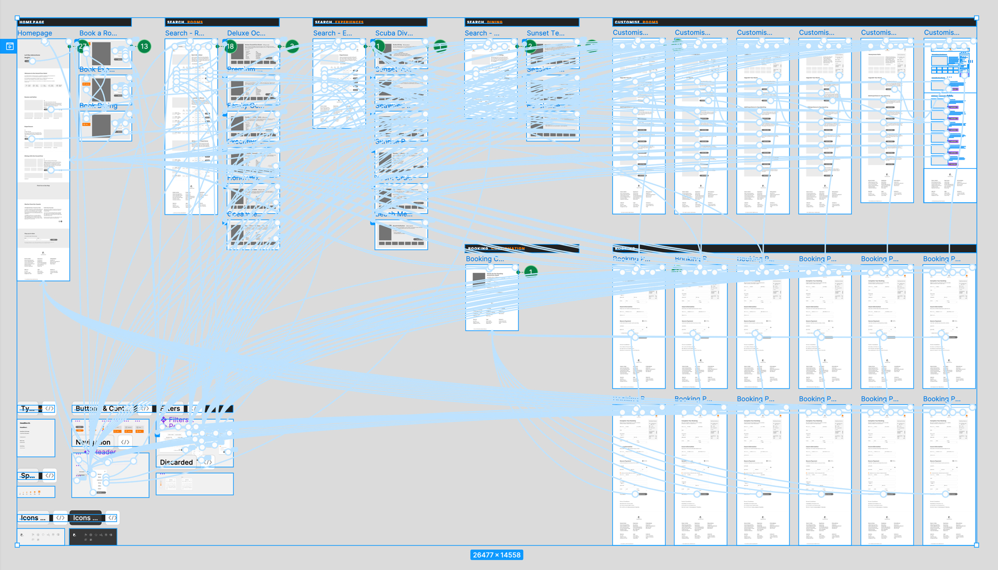
A Flow Diagram in the UX process is a vital tool that outlines the complete path users take when interacting with a system, website, or application. This diagram maps out each step, decision point and status change within the user experience, providing a clear and concise visual of the user’s progression through various tasks.
I use it as a tool in designing medical EHRs (Electronic Health Records) for mapping out each step and decision point in the complex medical processes.
Pathway: The ideal user flow, from the homepage to the booking summary page.
Wireframes
Only when I have completed all the necessary research, analysis, and ideation am I ready to start working on the wireframes.
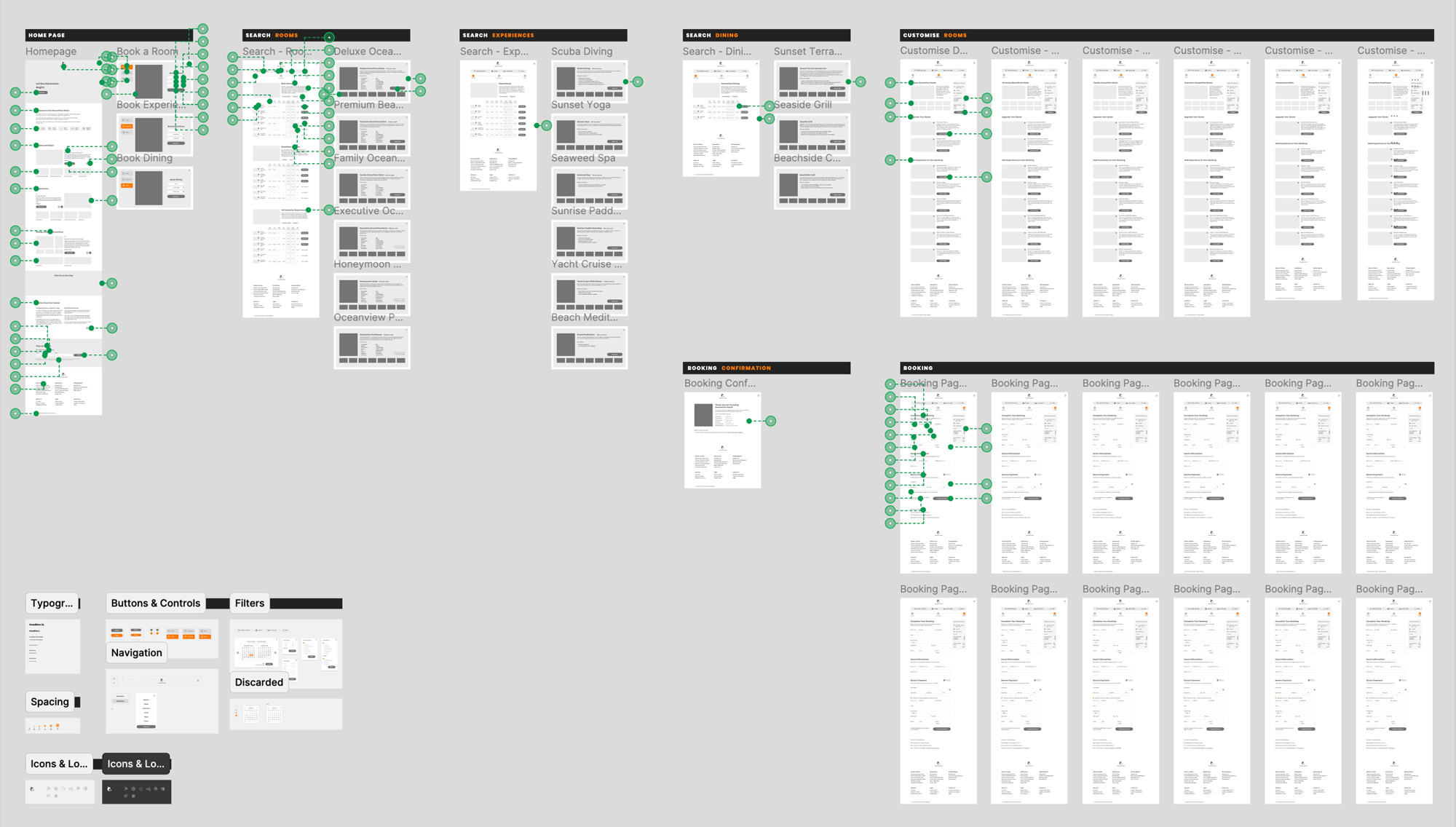
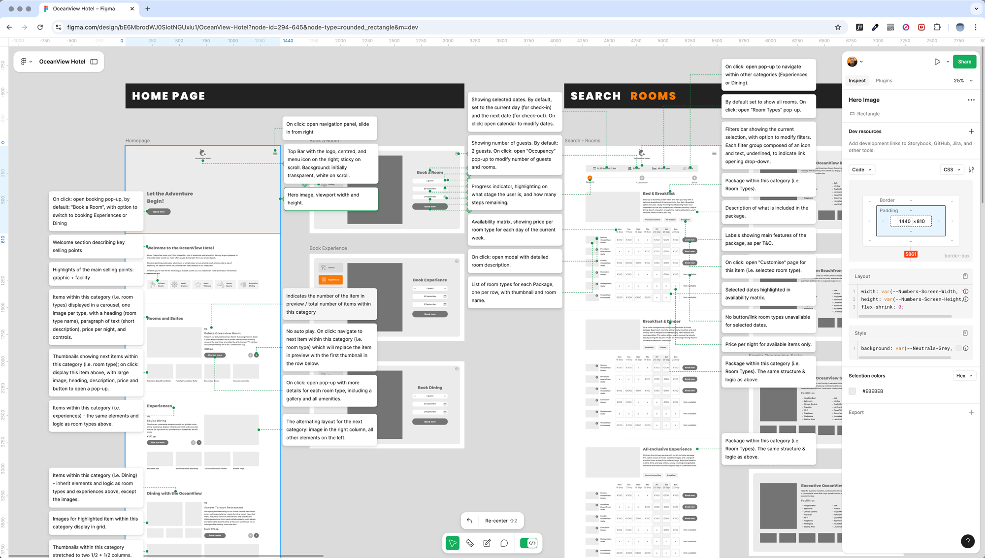
Wireframes are a fundamental part of the UX process, serving as a blueprint for the layout and structure of a digital product. They provide a visual guide that outlines the skeletal framework of a website or application, focusing on the placement of elements, navigation, and functionality without the distraction of detailed design elements or content.
Wireframes help developers and stakeholders understand the core functionality and flow of the user interface early in the development cycle.
Prototype
For this project, I created a prototype to specifically test the core booking functionality. of the website. At this stage, the focus was on ensuring that the user flow was intuitive and the necessary steps for completing a booking were clear and efficient.
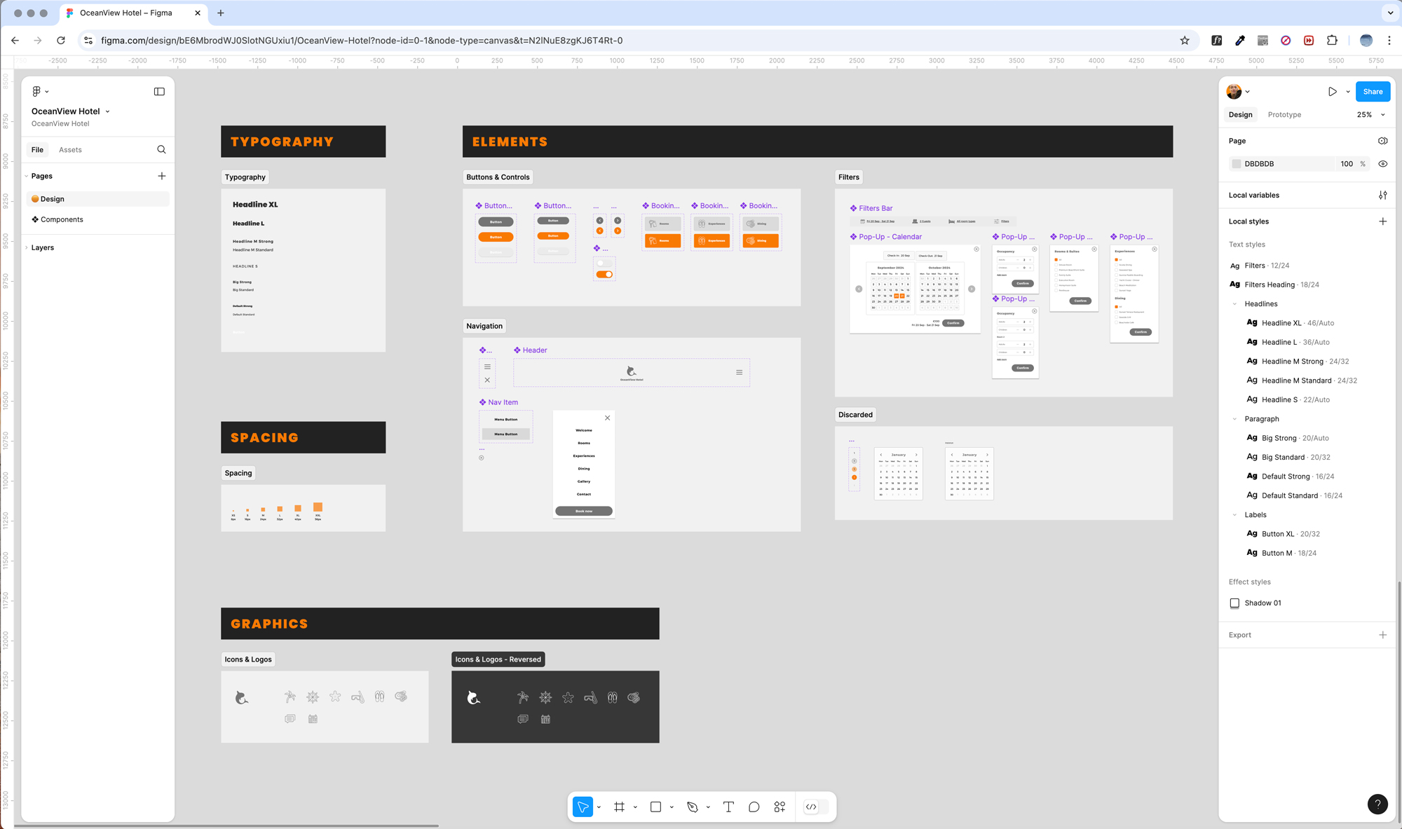
By omitting design elements such as colors and images, I concentrated solely on the structure and usability of the booking process..
This approach allowed me to gather meaningful feedback on how users interact with the system, ensuring that the primary features function smoothly before moving on to more aesthetic and detailed design phases.
Pathway: Booking accommodation (happy path), from the homepage to the booking summary page.
