How to Kill Patients Through Bad Design
Wrong Site Surgery
Wrong-site surgery is a serious mistake where a procedure is done on the wrong part of a patient’s body. Despite improvements in medical technology and procedures, these errors still happen. They can cause harm to patients, stress for doctors, legal issues, higher insurance costs, and loss of trust in healthcare, and sometimes even lead to death.
This is the first project in a cycle inspired by Medical Usability: How to Kill Patients Through Bad Design by Jakob Nielsen.
01. Research
Real-world cases
Two doctors mistakenly removed a patient’s only working kidney, leading to the patient’s death. Although manslaughter charges were dropped, both were suspended for failing to verify critical information before surgery.
Source: National Library of Medicine
A dermatologist removed skin from the wrong site after a confused patient and staff error led to a mix-up. The mistake resulted in a malpractice lawsuit.
Source: Dermatology Times
The enormous cost of 'never events'
Wrong-site surgeries are categorised as ‘never events’ – errors that should never occur in healthcare settings. However, the number of such cases remains very high.
In the United States, a study identified a total of 9,744 paid malpractice settlement and judgments for surgical never events occurring between 1990 and 2010. Malpractice payments for surgical never events totaled $1.3 billion.
Mortality occurred in 6.6% of patients, permanent injury in 32.9%, and temporary injury in 59.2%. Based on literature rates of surgical adverse events resulting in paid malpractice claims, we estimated that 4,082 surgical never event claims occur each year in the United States. Wrong-site surgeries account for about 24.8% of such events.
Source: ScienceDirect
In the UK there were 1,584 reported cases of wrong-site surgeries between April 2015 and September 2023.
Source: Health Matters
Identifying the user
There are two victims of this mistake: the patient suffers significant physical harm, emotional trauma, and possibly death, while the surgeon, though responsible, faces severe legal, emotional, and professional repercussions. The analysis of the problem shows that we are addressing the experiences of two users: the patient and the surgeon.
However, in context of a surgery, only medical staff is responsible for processing the piece of information which is location of a lesion. So, in order to solve the problem, we have to look at the process from the point of view of the the surgeon.
Mapping the process
During the process mapping stage of our UX design, we focused on recording and processing the information related to the location of a lesion in a Mohs surgery workflow. This phase involved identifying each step where lesion data is captured, updated, or referenced by medical staff. We mapped how the initial recording of the lesion’s location occurs during a dermatologist consultation, where the data is input into a free-text field in the patient’s electronic health record (EHR). Our process flow then tracked how this information is updated during diagnostic testing, reviewed by the surgeon for pre-operative planning, and referenced during surgery.
By mapping these interactions, I identified critical points where errors could arise due to vague or inconsistent text input, which could cascade into potential miscommunication, incorrect site marking, or wrong-site surgery. This mapping allowed us to pinpoint where improvements—such as using more structured input fields or visual diagrams—would streamline the process and reduce the risk of errors.

02. Analysis
Problems identified so far:
- The free-text format allows for vague and inconsistent descriptions, making it hard for medical professionals to accurately understand and track lesion locations.
- The absence of structured input fields (e.g., body maps, dropdowns) results in inconsistent data entry and a lack of precision in documenting lesion locations.
- Miscommunication and errors can arise due to ambiguous text entries, leading to potential clinical risks, such as wrong-site surgery or improper follow-up.

What can be solved with UX design?
While we may have limited control over human factors, we can address technical issues through UX methodology.
In the medical investigation leading up to surgery, once the site is identified, the anatomical location is recorded in the patient’s medical record. This digital form has evolved from its paper predecessor. However, further improvements to the digital medium can make it even more error-proof. Therefore, the goal of this UX exercise will be to design a method for capturing the precise location of a dermatological lesion, and remove room for mistake on the early stage, during initial recording of this data within the patient’s record.
In order to make this data consistent and usable for further processing, such as reporting, generating discharge summaries, or creating follow-up documentation, it has to be a checkbox or a radio button, not free text.
03. Prototyping
Gathering the Data
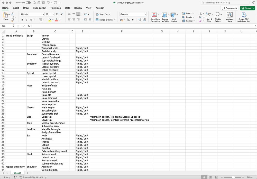
First, I need to put together a list of anatomical locations in dermatology. I will do this with ChatGPT. In the real world, at this stage, the list would be sent for review to a surgeon, but for the purpose of this exercise I will trust AI.
Interactive prototype
Then, I need to decide how to build the prototype. Since the list is quite long, I want to hide by default its content, and display only relevant options. Additionally, the prototype will include information architecture, so it would be best to create it in a format that can be handed over to developers – complete with relationships, API keys, conditional logic and rules. This will save them a lot of time!
Therefore, I will use the GitHub Form.io sandbox which will provide me with an interactive prototype for user testing and the JSON code for the developers.
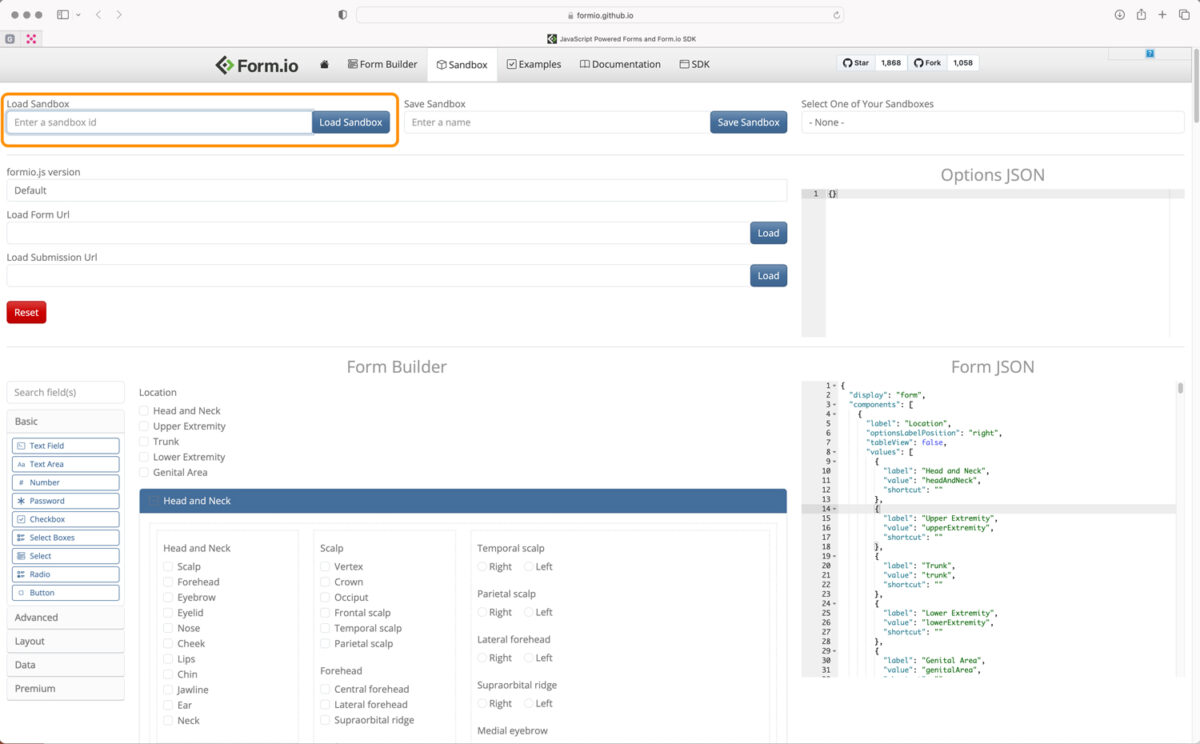
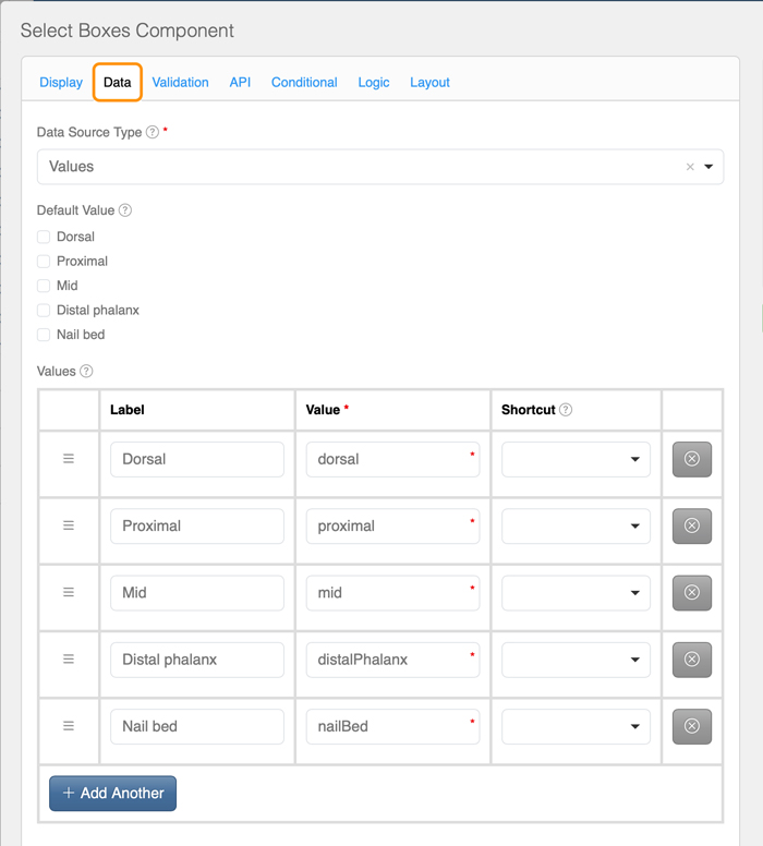
The form is built with checkboxes (Select Boxes) with options (Data). The Value of each options will allow the developer to target selecting data, and use in patient output document templates (Results, Discharge, Referral) but also can be used in PowerBI analytics.
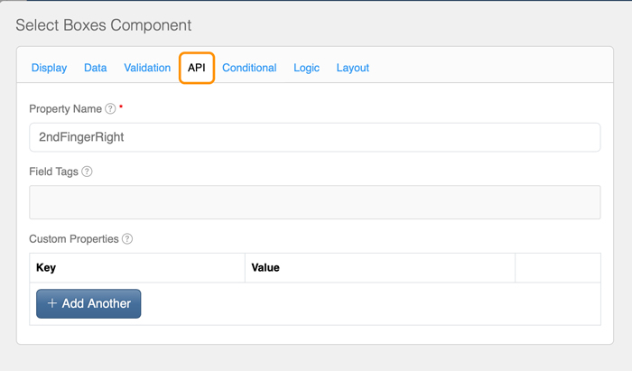
Each field has unique name which follows camel case naming convention.
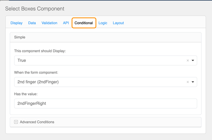
In order to keep the user interface as distraction-free as possible, all fields are hidden until relevant options is selected. This is done by setting up conditional logic for each field, and defining when it should be visible.
04. Validation
User Testing
At this stage, the prototype is sent to a Mohs surgeon for testing, with the following steps and access details:
- Follow the link: https://formio.github.io/formio.js/app/sandbox.html
- Enter a Sandbox ID: 66eb3cbe2113acab913601cb
- Click Load Sandbox;
- Scroll to the bottom of the page, to the Form Rendered section.
Once the content and structure of the form are approved by the user, the JSON code can be handed over to developers.
Screen recording showing location of the form within the Form.io interface
05. UI Design
Designing user interface
The UX phase of the project covered designing the content and structure of the form that allows users to capture precise location information seamlessly. Once the structure and content are approved, the next step will be to start designing the user interface. This step will include:
- Clear labels
- Logical field groupings
- Real-time validation feedback
- A distraction-free interface
- A color scheme following brand guidelines
06. Collaboration
If this was real...
In the real world, this design would be discussed with the business and developers (for feasibility) and with the surgeon (to determine the list of locations). The prototype would be sent to the surgeon for user testing. After receiving feedback, I would make adjustments to the design, potentially changing the data structure or even my entire approach! I would continue iterating the UX design cycle until it is approved by all users and stakeholders. Only then I would send it to developers, with JSON file and annotations.
However, I will stop at this stage, as the purpose of this exercise is to demonstrate my UX process and how I approach a UX problem. Please keep in mind that this is not a finished project.